 Written by ContentPowered.com
Years ago, before the fateful March of 2012, one great option Facebook marketers had was the ability to change what a user saw the first time they visited their Facebook page. They could specify one of their tab apps as the default landing tab. This was often used to tease content, encourage newsletter signups or otherwise present a unique face for the brand.
Then came March of 2012, with the update to the timeline version of Facebook, and the removal of the ability for marketers to change their landing tab. People complain about this change all the time – even as recently as days ago. If so many people loved the feature, why did Facebook remove it?
Cover Photos Work Better
One reason Facebook chose to change the default landing tab was surely to promote the new system of wide banner cover photos. Looking back today, it’s hard to imagine Facebook without them. Landing tabs were a way for businesses to present a large, branded image to attract users. Now, cover photos serve the same purpose.
Of course, the timing was also important. This change happened right before Facebook’s IPO, when they were focusing on the consumer more than the business. Aggressive marketers, those who seemed to rely on landing apps, were hurt; everyone else saw an upgrade in usability.
Additionally, some sources stated that landing tabs were largely ineffective. The vast majority of like activity came from links and ads, rather than the landing app. Both links and ads still work in enhanced capacity without landing tab apps.
Tabs Were Front and Center
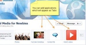
Immediately after this change, the page layout put tab apps in a large graphical grid, front and center, right below the cover photo. It was a great source of image encouragement to get users to click through the apps. Though arguably less valuable than hiding all page content behind a like app, it worked well enough. Creative businesses could even find ways to use the apps in interesting ways, now that they were larger and more graphical.
Of course, in the years since, this has changed again. Recently, Facebook changed the page layout once again, this time putting those tab apps off to the sidebar. In the top navigation, instead, is a mere textual link to a featured app and a drop-down list of apps. Not as encouraging, but cleaner and easier to navigate. Plus, the apps on the sidebar have larger graphics now.
That’s the way it is with Facebook’s updates; they take something away and give something in return, generally something that conforms more to their standards and is arguably less useful, but not back-breakingly so. And, as ever, Facebook remains too valuable a platform to abandon due to the changes; advertisers suck it up and adapt, rather than give up the amazing ad platform and huge audience.
Tab Apps are Harder to Regulate
Possibly one of the biggest reasons Facebook made the change was security. Tab apps generally loaded in an iframe, making them functionally invisible to Facebook scanners looking for violations of their ToS or of user security. Rather than attempt to regulate this as the Facebook juggernaut continued to grow, they chose to eliminate the possibility altogether.
Today, tab apps are as secure as they can make them. Facebook makes SSL mandatory for tab apps, which helps quite a bit. It doesn’t protect against a genuinely malicious business, but it does help prevent hackings and accidental insecurity. Another big part of the security, however, is just how little apps are used. Other than contest apps and some mobile-focused geolocation apps, most apps are either Facebook-operated – like the photos and likes apps – or are highly optional. The average user isn’t forced through an app, which makes compromising one that much less valuable.
Show, Don’t Tell
Sure, this is typically advice for writing, but it applies here as well. A fangate landing app did one thing that marketers considered important years ago; forced a user into an action just to see the content. This led to high bounce rates, as users liked the page to see the content, decided the content wasn’t worth it, and removed their like.
The takeaway here is that it’s more beneficial to prove to users that your content is worth liking in order to earn the like than it is to force them to like your content before they can even see what it is they’re liking. This is particularly important because likes are broadcast to friends and family, and no one wants public announcements about their mistakes.
With the main page front and center, businesses can’t trick people into liking a shallow page. Instead, they’re forced to put their money where their mouth is and earn their likes. The box of friends who have liked the page, the pinned posts, all of it helps encourage users to genuinely like a page rather than like it just to see what’s inside.
Fangates and Fan Exclusives Still Exist
Want to hide some of your content behind a fangate? They still exist, just not for Facebook pages and content. You can set up a third party program to require a like, a Twitter follow or some other form of social engagement to view a blog post, get a free ebook download or enter a contest. Sure, it doesn’t hide your full Facebook page, but why would you want that hidden anyway?
Landing Tabs Still Work
Here’s the big one; landing tabs still work. They just don’t work when a user clicks through to your page organically. The thing is, at any point in attracting a user, you can have them click whatever link you want. A Facebook ad can link directly to a tab app. A link on your blog can link to a tab app. A link anywhere other than Facebook’s search can link to an app. Any one of those can be used to link to a customized landing tab, specifically to encourage engagement and interaction on Facebook. You just have a wider array of options; you don’t need to use the landing app if you don’t want to.


