 Written by ContentPowered.com
Facebook has a long history of changing up features, adding and removing them to suit its own whims, not necessarily the uses businesses have for said features. One of the most often moved and changed features is the tab app.
Years ago, you were able to set a tab app as a dedicated landing page for your Facebook page. Before anyone could see your page itself, they had to go through this gate, which allowed you to lay on the pressure. With iFrames and careful coding, you could really lay on the pressure for an opt-in of some sort.
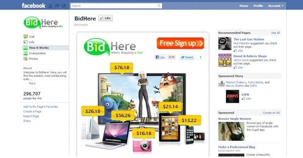
Back in 2012, this changed to their three-column timeline look. Back then, pages has an info bar on the left and two alternating columns of posts in the middle and right of the page. At the top, they had a section of boxes, four in total, which could be expanded by the user to show twelve. This is where tab apps were relegated, and it was quite a change.
Modern users will look at that post and see a layout that is very different from what is currently available on Facebook. Today, the layout looks a lot more like a personal profile, with a column of info on the left and a column of news posts on the right. At the top, the large graphical boxes for tabs are gone. Instead, only a few small text buttons remain, to tab between different sections of the page. The timeline, the About section, the photos app and the videos app are all default.
How can you use the modern tabs? What benefits do they have, compared to the old graphical buttons at the top of the page? Or, with the change, are they no longer valuable to use?
Tab Content
The first thing to know is that the new apps and the old tabs are the same thing. They were just moved during the page redesign. They aren’t graphical buttons at the top of the page, but they are still graphical buttons; just scroll down any page and you’ll find them in the left-hand column. They’ll be in a section labeled “apps” which displays up to three graphical app icons. If you have more than that, a > icon will appear to allow users to expand the box and see the rest of your apps.
Because they’re the same thing, the content of the tabs remains unchanged. If you want to run a contest, you put it in a tab app, just as Facebook has always mandated. The only major change in the last year or so is the removal of the like gate.
The like gate, if you didn’t know, was the ability to hide content behind a like. In other words, if a user wanted to use your tab app – such as joining a contest or registering for beta access to a service – they would need to like your page. Facebook determined that this was hurting businesses by allowing them to rack up low quality likes, and so removed the functionality. Any old apps that used that feature no longer work.
Positioning, Sorting, and Graphics
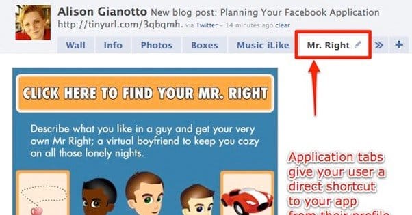
With the current page layout, your tab apps appear in two places. The first is the top tab bar. This is the same place they used to appear, with one change; they no longer have graphical banners tied to them. Rather, they’re limited to just a few words of text.
Most pages tend to only have the basic tabs. The Timeline and About tabs are mandatory and cannot be moved, removed, or changed in any way. The Pictures and Video tabs are not actual tab apps, they’re stand-alone Facebook apps, and they are mandatory as well. The only difference is, if you have other tabs, you can choose to hide the pictures and videos tabs.
Up to five tabs can be displayed in this top bar at a time. With two of them taken up by Timeline and About, that leaves space for three more. However, if you have more than five total apps – including pictures and videos – a “more” tab will appear. This means, realistically, that you can only customize two of your five tab apps in the top bar.
For an example of a business that has made skillful use of these two slots, just look at Blizzard. Their two custom apps are a customer service app and a hiring page app.
I have one gripe about Blizzard’s tabs, and that’s that they aren’t actual tab apps. Most tab apps are iFrame-style websites-in-the-window within Facebook’s border. This keeps users on your page while delivering content that doesn’t normally work on Facebook.
Blizzard, by contrast, uses their tabs as redirects to their main page. The hiring tab redirects to their global careers page, while their customer service tab redirects to their battle.net customer service portal. This is a good idea for their business, to keep all of that information in one place, but it’s not as great as an example of good tab usage.
The other location tabs are displayed is in the left hand sidebar, the information column. Here, photos and videos are stand-alone boxes, not tabs that need a custom thumbnail. The Timeline is obviously the other entire column, and the About section is a dedicated section at the top. This means the Apps section itself is limited to just your custom apps. Here, you have up to three apps displayed at a time, with a More expansion if you have more. Each app has a small graphical banner you can customize, as well as the title text it pulls from the name of the app.
To change the order of tabs in either location, just use the Manage Tabs option and drag and drop the tabs to move them into the correct positions. It’s quick, easy and painless to do. Save the changes, of course.
Making Use of Tab Apps
Some would argue that the new tab apps have decreased visibility compared to the old tabs. After all, they only have a graphic when they’re in the sidebar, with nothing but text in the top bar.
I disagree. In the top bar, they still stand out. Everyone is used to the normal Timeline – About – Pictures – Videos set. When something differs from the norm, it stands out, and that’s what happens with custom tabs. Maybe it’s not as eye-catching as a special graphic, but it doesn’t need to be. You should be using a few highly targeted apps rather than a large number of apps with little individual use.
How, specifically, can you use apps? Well, they work the same as tabs, so there’s no real difference. There are a ton of options, and it’s up to your business to decide what works best.


