Written by ContentPowered.com
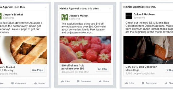
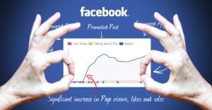
There are a whole host of different ad objects and ad placements on Facebook, ranging from basic website click sidebars to news feed video ads to mobile ads promoting apps. Yet there’s one thing they all have in common; they all have an image. Picking the right image, testing images, and getting attention through imagery is the key to Facebook ad success.
Of course, it’s never simple. I can’t give you a step by step guide to choosing and using the perfect ad image. All I can give you is advice, resources and methods you can use to test images yourself. By the time you’re done with this post, you should have an excellent idea of what images you want for your ads, and how to test them.
Always, always, always test your ads. Don’t let me or anyone else, no matter how authoritative we are, tell you the One True Right Way to do anything. What works for my audience might not work for yours, and what works for yours might fall flat with someone else’s. You need to test to make sure any technique you implement works. More importantly, you need to keep testing, to find better techniques and to refresh your ads. Facebook users very quickly grow used to seeing the same ads over and over, and will quickly ignore them given the chance. Variety regains their attention.
So, how can you go about picking a selection of great images for your ads?
Picking the Right Dimensions
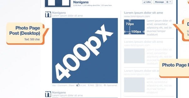
When I say there are a ton of different places you can put ad images, I mean it. Facebook has a dimensions page with ten different images with their associated dimensions listed. That’s nice, but it’s just their recommended size. Jon Loomer, an expert in Facebook ads, compiled an excellent guide to all the different exact sizes, recommended sizes and positions for images throughout Facebook. He also includes the ratio, the amount of text you can fit in the ad, and a whole lot more. I highly recommend you bookmark his article or download the PDF of the guide; it’s seriously life saving.
A lot of times, you’re going to want to campaign with one image throughout different ads, or different related images for the same campaign. It’s typically a good idea to have a source image large enough, with enough fluff background, that it can be cropped and resized to fit several different image positions. This is why exact dimensions aren’t entirely reliable; your image will need to fit more than one position.
In general, you’re going to want a letterbox style image, with a width wider than its height. This is because most images on Facebook are laid out that way, or at the very least are square. Very rarely is an image going to be in portrait layout, and it tends to stand out in a negative way.
Knowing Your Purpose
There are two schools of thought for Facebook ad images. The first is to always have an image relevant to your business. If you sell dog toys, your ad images should be pictures of dog toys, or dogs playing, or happy dogs. The second is to use any image you want, so long as it catches attention.
I’m somewhat firmly in the first camp. It does no good to use a picture of a tiger for your dog toys business; the people who find it eye catching and click it are expecting something relating to tigers, not to dog toys. The disconnect between ad image and landing page is jarring and leads to a higher bounce rate.
Plus, Facebook technically has rules against using unrelated images. The thing you’ll find out as you manage ads, however, is that Facebook is surprisingly flaky about enforcing their ad regulations. Some are caught, even over-enforced, while others slip through repeatedly. Unfortunately, it doesn’t help to point at another business and say “but their ad did it too!” Facebook still rejects your ad and the appeal doesn’t help.
Knowing Your Audience
Knowing your audience is the most crucial part of formulating successful ads, from copy to targeting to images. In this hypothetical dog toy store, you should know whether your audience is primarily attracted to large dogs or small dogs, active dogs or toy dogs, and so forth. You wouldn’t want to advertise tiny dog sweaters to an audience that mostly enjoys hunting with their dogs, would you?
Know your audience so you know what appeals to them. More importantly, you want to know what turns them off. Running an ad with an image they don’t notice is less than ideal, but it’s otherwise fine. Running an ad with an actively detrimental image will associate your brand and your store with that image, driving away customers.
There are a lot of ways to learn about your audience. You can study their interests and demographics through Insights or off-site analytics. You can run contests with polls attached, asking for information or preferences in exchange for an entry in a giveaway. You can just ask questions and foster discussion on your wall. All of this helps you figure out what your most engaged users are into.
Setting Up Sets and Testing Images
Before we get into more specifics about choosing images themselves, you should learn a bit about how you can test images against one another. Thankfully, this is a very easy process within Facebook natively, and you can use third party tools to do the testing for you.
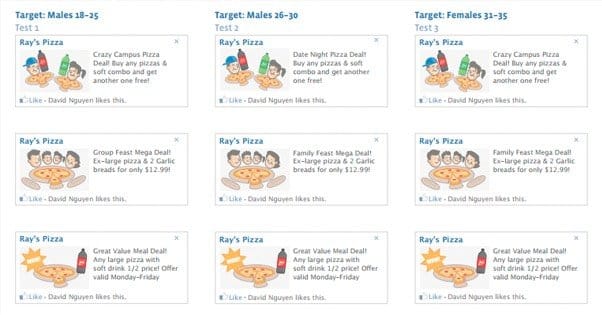
A split test, in case you don’t know, is a scientific comparison of two identical ads with one variable changed. You always need to limit yourself to one variable, otherwise you don’t know which change you made had the effect you measured, and your test is invalid. In the context of this post, what you’re split testing are images. You will have two identical ads – or three, or five, or ten – all running with the same copy, the same headline, the same landing page, the same objective, and everything else. The only difference between them is the image.
Split testing images can be drastic or minor. You can have one ad with a picture of a dog toy, one with a picture of a happy dog, and one with a picture of a mountain. You can have three more with the same dog toy in the first ad, but different colors. You can even have two identical images, only one has a thin border around the picture. There are nearly infinite variations you can test with ad images.
Within a Facebook ads account, you have campaigns. Campaigns are your overarching ad themes, like a set of ads about general products, another group of ads about special offers, another about seasonal discounts, and so forth. Within each campaign, you have ad sets. Ad sets are groups of individual ads that are more closely related. For example, you might have ten ads about specific dog toys all within one ad set, and another ad set in the same campaign promoting dog treats.
Your split testing will go on at the ad level, within the same ad set. I recommend having each set of variant ads grouped within one ad set, so they’re easy to keep track of as you test. Of course, that’s just my recommendation; neither I nor Facebook have set rules about how you have to use your campaigns, sets and individual ads. Use an organizational structure that makes sense for your campaigns and your business.
Finding Images Legally
I’m just going to make a quick note here; make sure you have the rights to use any images you use in your ads. More than once, I’ve seen companies confronted by artists and photographers whose work was stolen for their marketing. Sometimes, it’s settled amicably and easily. Sometimes it ends in a massive social sh*tstorm. Sometimes it even ends in legal action.
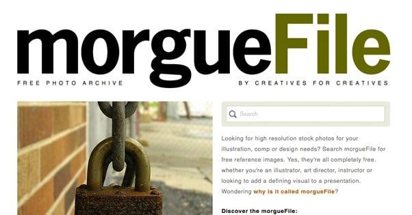
If you need resources for finding legal images, we’ve written about the issue here. The short version is: creating your own images from scratch or taking your own pictures is fine. Otherwise, buy stock photos or get them from free stock photo sites. The creative commons license is your friend.
The Notorious 20%
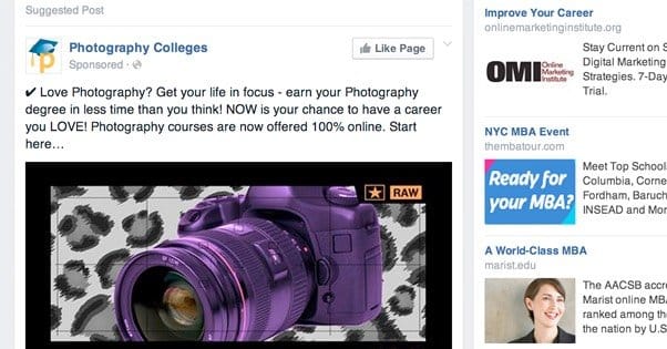
Facebook has a specific rule about text on advertisements, and it’s a very fickle rule. It’s called the 20% text rule, and it’s the bane of advertisers everywhere.
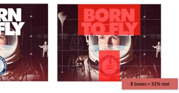
Essentially, Facebook has a grid tool that divides an image up into equally sized segments. The tool then identifies text in the image, and highlights the boxes containing text. Each box is 4% of the image, so if more than 5 boxes have text in them, more than 20% of the image is text. If more than 20% of your image is text, your ad will be rejected.
Here’s the thing; Facebook is notoriously fickle about what is and isn’t text, and what qualifies as grounds for rejection. Some ads make it through with text all over, while others are rejected for half of a low-hanging “g” ticking over into an extra box. Jon Loomer has demonstrated that simple positioning can adjust an image from 32% to under 20% text incredibly easily. Heck, even in the example Facebook uses, their 0% text image has text in it.
Unfortunately, this is a rule you’re going to need to deal with, because it affects all ads other than sidebar ads. Sidebar ads are too small to regulate using the grid tool, so text-images work there. Everywhere else? Just be careful.
Emotional Intensity
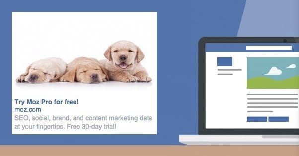
Alright, let’s start with some more specific tips for the images themselves. First up: emotion. If you go looking for advice on Facebook ad images, you’ll find a lot of people telling you that smiling people, happy people, specifically happy women are one of the most ideal subjects. This is true, but in a sense, any emotionally intense image can work.
The key here is to select a subject that fits with your message. Once again, if you’re selling dog toys, a happy person tossing a ball for a dog is a good image. You don’t want a sad person, which might imply a sad fate for the dog. You don’t want an angry person; who can stay angry at a dog? Your image’s emotional tone needs to mesh with your message.
Consider another angle. What if you’re selling pet caskets? It’s not a very bright subject. The only people shopping for that kind of product are people who certainly aren’t happy. Using a happy smiling person just makes the emotional tone more jarring. Of course, you don’t necessarily want to use an image of a sad person, in case that emotion rings false and the user thinks you’re mocking them. It’s all a matter of perspective.
In general, however, happy people tend to be good subjects. If you can get an image of a group of happy people, you can even divide that image up into multiple headshots for several ads.
Sex Sells; Just Not on Facebook
Sex sells in advertising; it’s a plain fact. It’s been a fact for decades. Heck, you can probably find ancient Sumerian stone tablets depicting scantily clad women hawking wares with more success than other merchants. It’s an enticing prospect as old as time.
Sex sells, but Facebook limits your ability to use that power. They have strict restrictions on what sort of sexual implication you can use in your images. For one thing, absolutely nothing involving nudity is allowed, even if it’s implied nudity. A censored image is still implied nudity, and it’s still well beyond what Facebook deems safe.
For that matter, Facebook will even reject ads that use cleavage or a male underwear model cropped down to the underwear. Even if there’s no nudity, it’s still a blatant use of sex to sell. As a general rule of thumb, if the image has the model’s head cropped out, it’s not acceptable for ads.
Facebook is exceedingly strict about using sexual imagery for ads, and the only leeway they have is when your image is relevant to your product. Your store selling dog toys is not going to get away with a mostly naked model in the ads, but the same model might be acceptable for a lingerie store. It’s all about context.
You can see some examples of what is and what is not acceptable in Facebook’s ad policies, here.
Logos for Brand Awareness
Logos can be good and bad in ads, depending on their placement and the logo itself. A general rule of thumb is to only use your logo when your ad is more about brand awareness and growing a page than it is about converting users or selling a specific product.
A logo grows awareness about your company. It’s an icon sitting there in a sidebar or in the news feed, and users process that information even if they don’t consciously note it. Later, when they see your logo somewhere else, they’ll recognize it from somewhere familiar, and they’ll be more inclined to trust your brand. If they click your ad, it should be a website views, page likes or other general objective.
Logos are only good to use on Facebook if they stand out. Unfortunately, this means if your logo is black and white, gray, or blue, it won’t stand out very well from the sidebar. On the other hand, if your logo is colorful or in a highly contrasting color, it stands out better and gets more attention.
Boost the Contrast
Speaking of contrast, sometimes it’s easy to make your ad stand out. If you want to use your logo, or if you’re using an image that seems to blend in more than you’d like, you can try adding a simple border around the image. A couple pixels wide, red or orange, it doesn’t take much.
In general, images that stand out and images that contrast from Facebook’s stodgy blue/gray theme work best. It’s difficult to gain the user’s attention, particularly with sidebar ads, which tend to be ignored or even blocked by many users.
Modern Memes
Making memes is easy. All you need is the right picture, some text in Impact Bold font, and a bit of a sense of humor. Not too much humor, of course; wouldn’t want to make an original joke. Original jokes are the antithesis of memes.
The problem with memes is that meme culture moves incredibly quickly. In the time it takes you to get a meme image approved for an ad, that meme could have already fallen out of style. You look like you’re capitalizing on an old trend and that you’re out of touch with the demographic you’re trying to reach.
Memes are most effective with a younger crowd, the type of people who frequent Tumblr and certain sections of Reddit. However, I don’t recommend using them in your ads. Why not? Well, first of all there’s the speed at which they rotate, which I already mentioned. Secondly, Facebook doesn’t really like them. They’re right up there with clickbait in terms of content that gets passively demoted. Essentially, they have less weight in EdgeRank than a non-meme image.
Memes are also very susceptible to the 20% text rule. They rely on bold, large text in order to convey their message, and that tends to take up more than 20% of the image in the grid tool.
The Unexpected Ad Image: Cover Photos
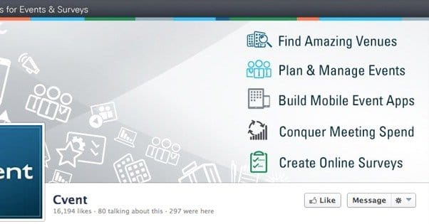
Your cover photo is like a billboard in some ways. It’s a large image that stands passively where traffic flows, delivering a message. For the last year and a half or so, Facebook has allowed a cover photo to include a call to action, which is very helpful. You can use graphical pointers to direct users to an app button, to a post, or in another direction entirely.
One caveat is that you don’t exactly have an option to pay to promote your cover photo. It’s not an ad, and if you make it into an ad, it becomes an image tied to a news feed post. However, you can still make use of the cover photo to put a little more advertising on your page.