 Written by ContentPowered.com
As Facebook moved into new territory with iFrames, the “Facebook Landing Page” reached critical acclaim with web designers hoping to increase revenue for their client’s sites. However, it’s actually pretty simple to switch from FBML, the old Facebook landing page, and iFrames, a new custom Facebook page with so many tabs and the ability to generate revenue. Landing pages have always been used as a tool for lead generation. These short pauses in browsing capture the attention of visitors with essential information or a design with cute cats and an email form. The FB landing page allows you to monetize Facebook and also stay connected with all of your adoring public.
How Landing Pages Work in Facebook
Landing pages are used frequently to draw the visitor’s attention with one phrase, image or link. With Facebook, you can now do this with tabs. What you choose to put on this tab is up to you. However, if you want to make money with your Facebook, you’ll figure out a marketing strategy to use the landing page to your advantage.
One way is to build upon what Facebook is essentially for: getting likes. When visitors come to your page, a landing page can actually prompt the visitor to like your page before seeing anything else. This is called a reveal tab. While this is just one type of landing page, it’s also one of the most successful. In order to get this type of tab, you can install a static HTML application found here. Just scroll down to where it says “Add to my page” to get it installed on your Facebook.
How to Create Almighty Landing Pages in Facebook
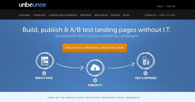
If you don’t have a lot of experience with designing a Facebook page, you may have already found a third-party application to help you design your landing page. Some of these applications include Pagemodo and UnBounce. This is probably the best way to design a landing page if you don’t know how to write code.
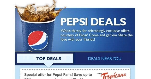
In the above example, you can use this application to install a 520 pixels wide image as your landing page which will prompt the visitor to like your Facebook. You can use any type of images you want for your landing page, as long as they are 520 pixels wide, which is a limitation set by Facebook.
Give Something Back, Too
Landing pages are great ways to promote new items and get more likes on Facebook. However, you should offer something in return. For example, if you have a business that sells T-shirts, offer a one-time 50 percent off deal to those who like your Facebook on your landing page. If you offer something incredible and worthwhile, you’ll probably get a ton of visitors.
Landing Pages for Email Lists
Email subscribers are another way to generate leads for your business. In fact, there have been increasing reports on how well email marketing works for getting visitors to your online store or instantly purchasing something from your business online. With a Facebook landing page, you can offer a way for visitors to click on a “Subscribe for Updates” link in order to build a bigger email list for your business. This is one of the essential ways that business are currently monetizing Facebook through the landing page.
How to Make Your Landing Page Stand Out
There are a few things that every landing page on Facebook needs to really affect the visitor’s decision. For one, you should have a very strong and descriptive headline that captures the viewer’s attention right away. This is like the opening line of a commercial, and you can really grab someone’s mouse button with the right catch phrase.
In addition, you can require name and email address entry boxes. This makes it easier for people to sign up for your email subscription without being escorted away from your Facebook page to subscribe. They just type in their name and email, and boom, it’s over. They can get back to browsing your Facebook page.
You also want to add a disclaimer in small print under any email subscription boxes that guarantee the provider won’t be spammed, and that you will keep their information private. People definitely don’t want their addresses shared.
Use Call-to-Action (CTA) that actively persuades visitors to opt-in for more exclusive information, such as “Subscribe to get the latest cat pictures on the web!” You could also go with something simple like “Register for exclusive offers!”
What are you giving back? Again, this is when you really need to hit home with the visitor. You can provide a small list for what subscribers get, such as personalized updates, special coupons or even a free t-shirt.
Images should be high quality. While you must remember to keep your image 520 pixels wide, you should also make sure this is a high quality image with a rather interesting and yet easy-to-read font.
Getting Fancy with Your Facebook Landing Page
Many businesses choose to do something really different with their Facebook page. If you have the web development team behind you or you can use a landing page builder, then you should definitely consider creating a funny video or slide show to go on your landing page as well.
Businesses also use testimonials from customers to show that they are a great company and offer amazing products.
You can also use your landing page to link out to other pages relevant to your business such as Twitter or your customer loyalty program.
Keep It Updated
The other part about landing pages that business sometimes forget is that they have to be updated with any of your new offers. Message match is essential to designing a relevant landing page for your business. The ad copy on your landing page should also match what you’re say in the headline. If you start off with, “Like this page and get a free pizza,” then your ad copy shouldn’t say, “By liking our page, you get 50 percent of your next pizza purchase.” It just doesn’t make sense, and yet this happens if you don’t update all of your ad copy.
In addition, your images should match what you’re saying with the text on your landing page. If you are creating a landing page with a whole marketing strategy that has a specific coupon displayed on other sites, make sure that the image is similar to other advertisements. This will help visitors recognize a great deal.
Focus on Promotions and Specials
Facebook landing pages are great for showcasing those products that you really want to sell or getting visitors interested with the latest deal or giveaway on your site. In addition, if they saw an advertisement that liking your page would get them something free, you should make sure to use this in your landing page as it will make your page seem more relevant and updated.
Putting It All Together
You really want to use the images and text of your landing page to say exactly what your business does. A bright picture of the beach for a Hawaiian hotel is more important than the right colors or text. The best landing pages on Facebook offer an eye-catching design with bright colors and high-resolution images. It doesn’t have a lot of busy images or text. It’s simple and easy-to-read. There should be a focused message with a big call-to-action. In addition, any email forms should keep visitors on Facebook because the visitors have chosen to go to your page for a reason. You don’t want to send them elsewhere.
Also, you want to make sure that you’re showing what benefits that the visitor will have from taking part in your landing page. Whether it’s a deal for liking the page or for filling out an email form, they should be getting some kind of recognition for giving you business. This is the first impression that this visitor has for your business, and therefore, it’s the most important impression that they need to continue doing business with you.
In the end, a Facebook landing page really focuses a visitor’s attention. There’s no guarantees that a visitor will like your page just because you prompt them to, but it’s better to have a landing page that’s creative and makes it simple, rather depend on the change that they’ll click that little button in the corner. If you direct the visitor’s attention and make a genuine landing page with the right information and benefits, you’ll probably capture more than their attention.


Unbounce resource was very helpful, just signed up. Cheers