 Written by ContentPowered.com
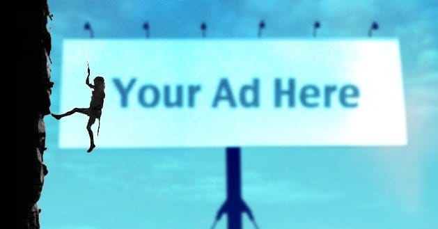
Facebook ads; you either love them or you hate them. If you strike on the right formula with luck your first time around, the income is amazing and there can be nothing but love. If you struggle to find the right combination of ad, targeting and landing page that converts customers, you’re going to hate them.
If you had that stroke of luck, you’re probably not here reading about how you can improve your ads. If you’re looking for ways to boost your ads into the stratosphere, you’ve come to the right place.
There are three essential parts to any Facebook ad. You need to improve each of them. While you do, make sure to test out variations each step of the way. The core of this concept is split testing. Create two ads that share attributes, but tweak one thing about them. Figure out which works better after a low budget and a few days live, then adopt that one. Iterate, tweak it in new ways, continue.
Occasionally, of course, you’re going to have to do something new. Everyone gets bored, even of the most novel and interesting things. Eat your favorite food every day for a year and by the end of it you’ll be sick of it, no matter how much you liked it before. Consider your ads to have a shelf life and remove them before users grow sick of them.
1: The Best Image
Facebook has a few guidelines for images, but you’ve probably been following them to the letter, and it hasn’t worked out all that well so far. Instead, ignore most of them. Here’s what you need in a great image.
Size. Pick the right resolution image. Small sidebar ads should absolutely never had small details that are impossible to make out. Try this; pull up the large image you want and then go stand across the room. Can you make out all the details you want to? If not, they’re too small to be made out in Facebook’s tiny sidebar.
This doesn’t mean you should use a tiny image. Facebook allows you to use the same image for both news feed and sidebar ads, which you probably should. Unless you’re specifically working with one format or the other, optimize for both. This means an image large enough to be compelling in the news feed, but lacking the small details that make it a jumbled mess in the sidebar.
Here are some ideas you can use to create great images for your ads.
- Use images of happy people, particularly women. Say what you like about gender constructs in modern society, the mob rules indicate that a smiling woman is still one of the best images to use.
- Use colors that stand out. Remember that Facebook is primarily blues and grays with black and white. Pick a color that stands out with your branding, so you don’t blend in with normal navigation elements. Colorful mascots work as well, if you have one.
- Use your logo, if it’s something that stands out in a positive light . If your logo is too muddied at a small resolution, give it a pass or create a simplified version to use.
- Use animals, particularly either exotic or adorable animals. A pet interacting with your product can be a great seller, particularly to owners of that kind of pet. A more exotic animal draws attention from the user wondering what it is.
2: The Best Headline
Your headline is the bold text that will hook the eye after it’s drawn over by the image. Consider fishing. The image is the shiny lure, to draw fish in. The headline is the bait, to get the fish to bite the hook. The body copy itself, covered next, is the hook that gets them stuck.
Your headline needs to grab attention and not let go, but you only have 25 characters to use. You don’t have a lot of space, so you need to use every letter effectively. Here are some ideas you can spin off and test.
- Free Shipping Guaranteed! This headline covers two bases; guarantee and free. With a guarantee, you’re making an implicit or explicit promise to the user. You need to be able to live up to that promise, of course. With the free offer, you’re telling users you’re confident in your product and can offer them something of additional value free.
- 75% Off Today Only! This headline also covers two bases; the deep discount and the time-sensitive offer. With the deep discount, you’re making the user feel like they’re going to miss out on a great deal if they don’t click immediately. With the time-sensitive offer, you’re doing the same thing; stacking both up gives you more room to work.
- Warning: Avoid the Scam. This headline is a shock-value attention grabber, meant more to inform the user than to offer them something. Rather than tell them about a deal they’re missing, you’re telling them that if they don’t click, they’re running the risk of being scammed, possibly by a shady competitor.
- Unlock the Truth Today! This headline covered both the unlock concept and the draw of the truth. You’re subtly implying that the user is being lied to and that you have the truth in hand. You’re also offering them the ability to unlock that truth for themselves.
3: The Best Copy
Your ad copy will pull a lot of weight, but you need to use it effectively. You’re going to be surprised at how little space you have to work with, once you realize how much you need to cram into the little sidebar box.
- Play off the headline. If you’re asking a user to unlock the truth about something, tease what that truth might be. If you’re offering a deal, write about what benefits they’ll receive when they accept the deal. When in doubt, go with the standard features and benefits list.
- Use punctuation to break up the test. It’s hard for the average user to bother caring about ad text long enough to read all of it.
- Use short, punchy phrases and punctuation to give them words they can digest at a glance. Even a dash – or a slash / can break up text effectively.
- For the love of God, make sure you don’t have any typos or misspelled words in your copy.
With effective copy, you can finally entice users to click through to your landing page. From there, it’s a whole new game convincing them to convert.

