Written by ContentPowered.com
All the theory in the world is worthless if you can’t put it into practice. Unfortunately, so much of SEO writing is theory and so little of it is backed with examples and hard evidence. That’s what I’m here for; to show you some of the best Facebook business pages alive today, and to explain what they’re doing right.
Facebook Page Optimizations
Before we get to the specific examples, let’s look at the lesson plan. In order to tell if a Facebook page is optimized, you need to know what goes into optimization. Here are the guidelines to look for in the pages I’ll display below.
1) A great custom URL. The ideal custom URL is just your brand name. If you can’t get a hold of that, get something evocative of your brand, like an iconic slogan, abbreviation, or assertion of your reality.
2) Use of keywords in various descriptive text. Ideally, product listings and various demographic information will appear, to appeal to people searching for those sorts of items.
3) Links to other channels, including other social media sites and websites.
4) Large, robust images. A compelling banner app, a compelling profile picture, and images that take full advantage of the width of the news feed are all essential for a vibrant page presence.
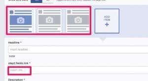
5) App Optimizations. Tab apps are a bit out of the way compared to their top bar prominence before last year’s redesign. That said, they can still be very compelling, if used properly. A featured tab is important, as are tab app images. These are really tricky to get right.
6) Links (Without Links). One great thing you can do on Facebook is create a link that generates a preview, and then remove the text link. This creates a large graphical link, but doesn’t clutter up your text post with the link a second time.
The Examples
Example 1: Old Spice
The deodorant brand has gone whole-hog into branding with a unique twist in recent years. That twist is insanely macho charisma. Their page has it in spades. Let’s look at the list of optimizations and check them off.
- Custom URL: Check. Nothing much to say about it.
- Keywords in text: Check. The About section lists various products in a simply descriptive line. Their long description is a little lacking, just full of links and a disclaimer.
- External links: Check. Their long description is full of them.
- Images: Check in spades. Old Spice has a very unique type of imagery, and it’s everywhere on their page. Even their tab apps have crazy pictures backing them up.
- Tabs: Check, barely. They have an interesting tab app image, but it’s not really descriptive. “Downloads” doesn’t mean much.
- Links: Unknown. Old Spice actually posts all of their content directly to Facebook, primarily in the form of videos. You actually have to scroll quite far to get away from on-site posts. This isn’t necessarily a bad thing, but it means it’s hard to judge the success of this metric.
Example 2: Skullcandy
Skullcandy is everything you’d want out of hip, x-treme lifestyle accessories. They appeal to youth, they make high-end equipment and they’re designed to meet a certain demographic. But what about the checklist?
- Custom URL: Check. Nothing much to say about it.
- Keywords in text: Check. Their short on-page description is lacking, but their longer description is nicely filled out with both product keywords and demographic keywords.
- External links: Check. Their website is prominently displayed, and they have an Instagram tab at the top.
- Images: Check. Skullcandy promotes a certain type of culture, and they have numerous high-res pictures of that culture. The only gripe I have is the slight lack of pictures of their actual hardware, but the pictures they do have are beautiful so I’ll forgive them. This time.
- Tabs: Check. The Instagram app feature is a good touch. My gripe is that the other two apps on their sidebar aren’t nearly as descriptive, but then, I don’t know a lot about the brand. Maybe they make perfect sense to a fan.
- Links: Unknown. Unlike Old Spice, Skullcandy does link externally relatively often. They use Bit.ly shortened links, but they attach them to images in the description. This actually gives them a larger preview, but at the detriment of eliminating the click-image-to-link aspect of link previews. Not ideal.
Example 3: Threadless
Threadless is an apparel manufacturer that’s all about graphics. Everything from cute graphics to weird mashups of culture is within their area of expertise. But how do they stand up to the checklist?
- Custom URL: Check. Nothing much to say about it.
- Keywords in text: Check. Both their short on-page and long descriptions are robust and fleshed out with mission and keywords.
- External links: Check. Just like Skullcandy, their Instagram is linked up top and their actual website is linked everywhere.
- Images: Check, check, check. Threadless is 100% focused on the creative artistry of their apparel, so every post they made has some cutesy graphic attached.
- Tabs: Check, and the winner of this trio. Their featured Instagram app is good, as is their support tab, which even features an interesting design for the app image.
- Links: Check. Threadless uses both methods, the shortened link in image found on Skullcandy and the linkless preview that’s most recommended. Overall, they make excellent use of the format.