Written by ContentPowered.com
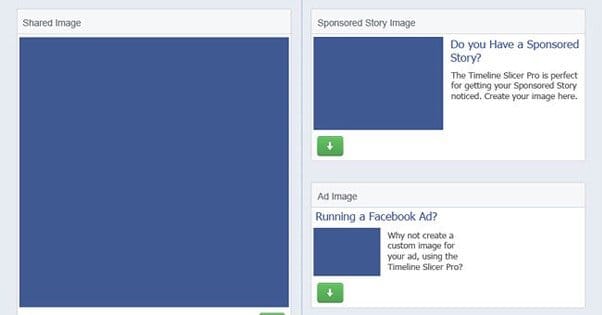
Facebook ads are tricky. There’s no doubt about it. A huge part of success with Facebook ads comes from your targeting, and I’ve talked about that at great length. Now I’m going to focus on the other side of the coin; the ad itself. Your copy, your image, your position, it’s all relevant. You need to choose the right kind of ad for the right purpose, and customize it so it’s ideal for your business and audience.
Thankfully, you can use some basic templates to start off on the right foot.
Things to Keep in Mind

Before we get into templates, you need to learn why the templates are what they are. There’s a lot of information and a lot of work that goes into the design of an ad, and it has to keep within the guidelines Facebook sets forth for ads. On top of that, you have to customize your ads for the expected audience and attitudes you anticipate will be viewing your ads. Only once you understand why the templates are put together the way they are, will you understand how to customize them without ruining what makes them great.
- The 20% text rule. This is a hard and fast rule for all non-sidebar ads on Facebook. They use a grid tool and count the number of boxes on the grid that have text in them, even partial corners of letters. If the number of boxes is greater than a certain number – 20% of them – your ad is declined. Often, all it takes to fix it is rearranging or slightly resizing the ad text, so make sure you run your ad images through the grid tool to test yourself whether they’ll pass.
- The human preference for visuals. A huge part of the success of ads on Facebook comes down the images you use. This isn’t something a template can do for you; you need to figure out what images are most attractive and relevant to your business, and what work best with your audience. This means a lot of testing! Don’t think you’re getting out of the work just because you start with a template.
- The colors of Facebook. Facebook is a primarily white, blue, gray, and black website. All the profile pictures, post previews, ads, and icons make it look more colorful than it really is. What does this mean? Don’t use those colors in your ads! Avoid ad images that blend in, use contrasting colors, and make your ads stand out.
- The relevance of your ads. Facebook monitors how relevant your ad is to the page it links to, and that can affect the costs and reach of your ads in the future. Always make sure that when your ad is focused on one product, it links to a page promoting that product. Even simple disconnects, like promising 15% off in the ad and only offering 10% off on the landing page, can tank your relevance scores.
- The innate draw of your offer. You can have the best, most attractive ad in the world, but if your offer is “buy now and get 10% added to the purchase price,” no one is going to click it. Your offer needs to be as attractive as the ad.
- The promoted call to action. Your ad needs to make it clear what you want the user to do. Obviously, step one is to click the ad, but then what? Are you trying to sell a product, give away something, get users to claim an offer, watch a video, or something else? Make sure your call to action makes it clear what is expected of the user when they click.
- The ad position and type. This is what the templates are all about, and you’ll see more about it in a moment. First, though, an overview. There are three main positions for an ad; sidebar, news feed, and mobile. Mobile ads are very much like news feed ads, they just show up on phones and tablets. Sidebar ads tend to be cheaper, but have lower click rates and higher ignore rates. I’ll try to give you at least one good template per type of ad within each position, so video ads, image ads, post ads, sidebar ads, and so forth.
1. The Sidebar Ad
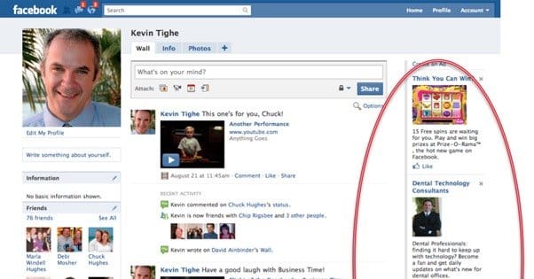
As I mentioned, sidebar ads tend to get little visibility and attention. They’re stuffed off to the side along with Facebook’s suggested pages, trending bar, and other nonsense everyone ignores. In order to succeed on the sidebar, you need to stand out, which means bright and vibrant colors. I recommend a brightly colored background and a border, if you’re using an image that lends itself to it, like a picture of a product. If you’re trying to use a photograph, don’t. They’re too small and muddy on the sidebar to stand out.
A good sidebar ad is highly visual, because you’re attracting people solely based on the image. The text may as well not exist if the image doesn’t draw people over to see it. It also, of course, has to be relevant. This means relevant to your business and relevant to your audience. As such, sidebar ads tend to work best when targeted at your existing audience, rather than a new audience you want to reach.
As a template, I recommend, as mentioned, a simple image with bright colors. A detailed product image works well, like a t-shirt design or a row of wine bottles. Your title text should be your offer, concise and appealing. Your description is a place to expand on either your offer or your business, depending on which you feel needs more promotion.
2. The News Feed Promoted Post
News feed ads are also known as promoted posts, because they have to follow the guidelines Facebook puts forth for both ads and organic posts. That means you need to keep a lot of different rules in mind while you make one.
A news feed post ad has a text post, an image, a title, a description, and a URL. It’s also capable of being liked, shared, and commented on, so you may want to phrase it in a way that promotes those.
Large, vibrant images work best here. Photos can work, as can product images or vibrant vector designs. Your text post needs to NOT have a URL in it. The image and URL preview all count as a link, so you don’t need to double up. Avoid hashtags as well, studies have shown that they reduce post visibility and engagement.
As always, make sure the post has a clear call to action. You’re not just trying to get users to click the post, you’re trying to get them to do something on the landing page. What is it, and why do they want to do it? Typically, you want them to opt in to your mailing list or buy your product.
Pick one and go for it, don’t try to wobble between the two.
3. The News Feed Video Ad
Video ads are unique in terms of ad space because they really haven’t existed that long. They play a short video using Facebook’s normal autoplay. It’s great for a number of reasons, not the least of which being that it’s so new. People don’t expect videos themselves to be ads on Facebook, they expect to be shuttled to another site for a video. Videos are, of course, hugely visual forms of media. If you can make a compelling Vine, you can make a compelling Facebook video ad.
Video ads have a text post component, but they don’t have a title, description, or link. Clicking the video doesn’t take the user anywhere, it just pauses or unpauses the video. Therefore, you have to include a link in your description. A customized URL or a shortlink is recommended here. You also need to make the text post short enough that it doesn’t truncate the end, cutting off your link.
Keep your video short for maximum visibility, and front-load your message so even the people with limited attention spans can see it and be drawn in.
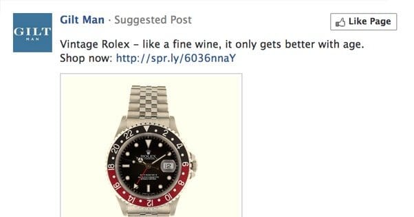
4. The News Feed Photo Ad
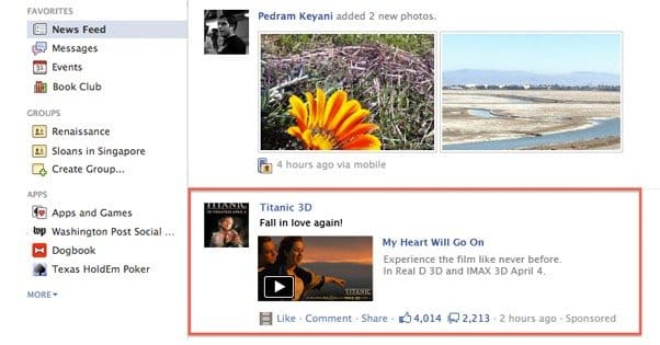
Photo ads are more or less identical to promoted post ads. The only difference is, promoted posts are also organic posts. Photo ads are not, they’re just ads. This means they don’t have the like/share/comment functionality. That said, follow all of the rest of the tips for promoted posts. Write a link and hashtag-free text post, produce a vivid and attractive image with an offer and a CTA, customize a great title and description, and of course target it properly.
These ads are great to showcase a product in some way. I’ve seen food companies show attractive pictures of food, and that’s what you’re modeling your ads after. You don’t need much for a CTA. “Free trial!” or “15% off!” is really all it takes. The surrounding text takes care of the details. This helps you keep on the right side of the 20% text rule.
Another option is to create a miniature photo collage. You can use this to promote more general store-wide deals, by showcasing multiple products at once.
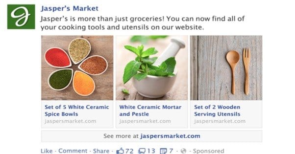
5. The Multi-Product Ad
The multi-product ad is a mobile-specific ad that is created only through the Facebook power editor. You can find the power editor here; I haven’t linked it in a while. It’s a plugin that specifically works with Chrome to help you create Facebook ads, and I highly recommend it.
A multi-product ad is interesting, in that it has one text post at the top, but several images the user can scroll through freely. In order to inform the user that there is more than one image, the primary image only takes up 80% of the image box. The remaining slice, on the right side, is the left side of the next image in line. This means you need portrait-style narrow images or square images to fit in this slot.
It’s best here to offer several different deals, perhaps under one primary heading. Your text post can talk about store-wide sales, while each individual image can showcase a product, and use its description to mention the specific deal for that item. Make sure to put some of your most compelling deals here.
6. The Local Store Ad
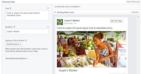
Local ads on Facebook are limited in two ways. First, you can only create one if you’re a business that has a physical location, because the ad centers around your location. Second, you can only target local users, because there’s no reason to target anyone outside of the range of your business.
Other than that, they’re mostly just like page post ads. The CTA button baked into the ad layout can be something like “get directions” which helps users find you. Don’t make locating you the focus of your ad, though. It’s a fringe benefit.
For images here, I recommend something more local. An attractive picture of the outside or interior of your store is better than pictures of individual products, because it gives your ad a local feel. You want users to feel like they have an intimate connection with your local business, to help support it.
7. The Offer Claim Ad

Facebook has a new specific kind of ad just for offers you can make. They are, again, more or less identical to promote posts. They have the like/comment/share options, they have a description, a large image, and some additional text. The difference here is, they have two CTAs. The first one, at the top, is a page like. The second one, at the bottom, is the offer claim button. The additional text, rather than being a title and a description, is the offer and the expiration date of the offer. It also shows how many people have claimed it.
One point of friction here is that you have to run the offer through Facebook. You can’t have an offer on your site and promote it on Facebook using the offer claim objective, because it won’t track data.
There’s not a lot of room for customization of this ad. Everything is fixed with your offer, except the top description and the image. The top description should be something to promote your ad, possibly just a cleaner restatement of the offer itself. The image, ideally, will be a picture of what specifically is on offer. If that’s not attractive, go for something a little more conceptual.
8. The Event RSVP Ad
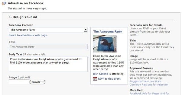
Event ads are ads that, again, rely on something you’re running through Facebook. In this case, it’s an event, and it needs to be an event you’ve set up on Facebook using your page. I recommend targeting them at specific demographics within the overall group you want to attend. If you’re hosting a concert with three bands, for example, run three event ads, one for each band, promoted to people who are interested in that band.
Much like the offer claim, it comes with the free page like CTA at the top, and the same format. The difference is the CTA at the bottom. The event RSVP ad allows users to RSVP for the event, or if you’re selling tickets, will direct them to a site where they can buy those tickets. Helpfully, this doesn’t need to be on Facebook.
Events tend to have a central focus, be it a band, a location, an animal, a type of food, or what have you. The ideal here is to customize your picture as something attractive about that central focus. If it’s going to be a large general event, like lollapalooza, you can use an event logo or wider shots of the venue instead, to showcase scale.
9. The Retargeted Ad
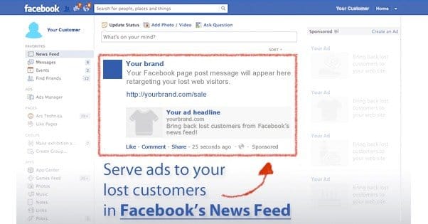
Retargeted ads are a special type of ad that, again, can only be made with the power editor. Other than that, though, they can be one of any of the varieties of ads listed above. Rather than a special type of ad, they’re a special type of audience. You can read all about retargeting here.
The benefit of a retargeted ad is that you don’t have to work to get the user interested in what you have to sell. You already know they’re interested, because they already displayed that interest by visiting your site and performing some action that made them part of your retargeting list.
This means your image can be focused on something particularly enticing to the user. You can offer special deals, you can showcase specific items, and you can appeal to them in a way you can’t when you’re trying to attract new users. You can even retarget converted customers by showing them deals on accessories for the products they bought.
10. The Engagement Ad
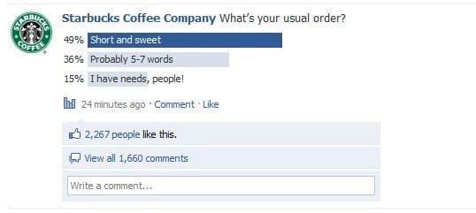
Engagement ads aren’t a specific type of ad. Really, they’re more of a trick. What you do is you run a promote post ad or a photo ad, and you use a photo with text on it that asks a question or offers a fill in the blank statement.
These ads are most often made using the page like objective, because the page like is really all you’re going for. That, and engagement. That’s the trick to the engagement ad; you’re not trying to shuttle people to a specific objective. All you’re trying to do is get people to engage with a post you made, which increases their EdgeRank with your page, which makes them more likely to see your organic posts.
Needless to say, you only use news feed ads or mobile ads for this. Sidebar ads don’t have the opportunity to engage, so they just don’t work.
11. The Reminder Ad
A reminder ad is another generic news post ad, but again with a trick tied to it. You can use it with any objective and any copy. Generally, it’s a subset of the retargeted ad, because the goal is to remind people of your offer.
The general format for this ad is “You forgot something.” What did the user forget? Something about your offer. You can promote your offer again as it is, or you can promote some other feature that didn’t get much screen time on your landing page. Some users respond better to other features, but aren’t a big enough segment to warrant changing your landing page, making this the perfect ad for them.
“You Forgot Something! But that’s okay, we’re added an additional 5% off to make sure you remember next time.”