 Written by ContentPowered.com
Facebook ads have three major elements to them. These elements are placement, copy, and image. We’ve written before on all three subjects, but this time we’re focusing on images. A surprising amount of attention and detail goes into picking images to use.
We’ve written on the subject of images before. If you haven’t read those posts yet, you probably should. One details how you can go about picking the right size, subject, and variations on your ad images: How to Easily Create an Attractive Facebook Ad Image. The other gives you 11 Types of Images Proven to Engage Your Facebook Fans. Use that one to help brainstorm ideas on what the general subject of your ad images should be.
Many of the examples I’ll give below will not be images you can copy and use for yourself. They’re specific to the business using them. They should, however, be able to give you an idea of the relationship between your business, your campaign, and your ad image that you should be aiming for.
1. The Look of Silence Carousel
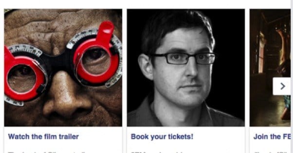
This is a sponsored carousel ad for a movie release, specifically a documentary. The ad is interesting because it takes advantage of how carousel ads work. Carousel ads have multiple pictures and encourage the user to scroll through them, which gives you an opportunity to use more than one image if you’re torn between 3-4 options. Carousel ads also allow each image to link to a different page, which is typically used for a set of products on sale.
In this case, each one uses a distinct call to action related to the movie release. You have watching the trailer, booking tickets to see the show, joining the discussion on Facebook – with a Twitter hashtag included for off-side assistance – and who knows what else off to the side. This not gives the producers ample opportunity to measure different objectives. Even something as simple as swapping the order around can have a pretty big impact on what users do when they click the ad.
2. Veggies from Jasper’s Market
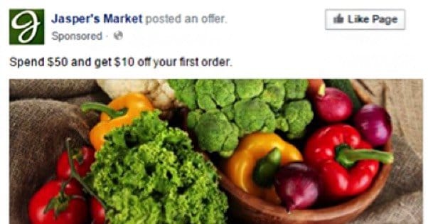
This is an offer claim ad, which means the Market has an offer available for users to claim. It’s a simple $10 off coupon when spending $50 or more for the first time in the store, so you know it has to be targeting an audience of people who either have never been to the store or have never converted.
The image itself is very bright, vibrant, and colorful. In the drab sea of blue and gray on Facebook, it’s very eye-catching. The brilliant colors draw attention, and let you know what sort of item you might be able to get from the store before you even know what the store is. Plus, with vegetables, bright colors indicate ripeness and readiness to eat, so it indicates that the produce you would buy from Jasper’s will be fresh and delicious.
3. Rue La La’s Video Preview
Facebook has rules against making an ad image look like a video player when it’s not. That includes centrally located video play buttons. You may have noticed that this ad has a video play button, so why am I featuring it? It’s a video views ad; that’s not a misleading image, it’s actually the preview frame of a video ad.
I like this image for two reasons. One, it showcases a lot of different products in a lot of different categories, from belts and knives to sweaters and accessories. It gives you an immediate idea of the kind of items and styles you can find in their store.
The second reason is that there’s clearly text in the background, but you can’t read it. The implication is that the items will move and you will be able to see the text when you play the video. It makes you curious what it will say. It also, because it’s obscured, won’t count against you if Facebook’s 20% text rule comes into play.
4. NatureBox’s Visual Feast
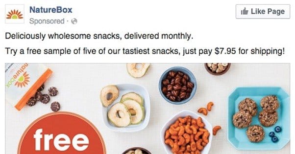
I’ve never subscribed to the NatureBox service, nor have I visited their website, but I can tell you that they’re a monthly subscription service sending wholesome, tasty snacks that center on the organic, nutritious and nutritious end of the spectrum. I can tell you all of this because of the ad they ran.
Taken as a whole, you can see the attractiveness in the image. They have a carefully produced “haphazard” layout for their snacks, something that hints at a chaotic but healthy lifestyle. Plus, all the snacks look super tasty. Some kind of roasted cashew? Some blueberry granola balls? A popcorn mix? Dried fruits? What’s not to love? Plus, the big “free trial” label is attractive in its own right.
5. Outbound Engine’s Relaxation
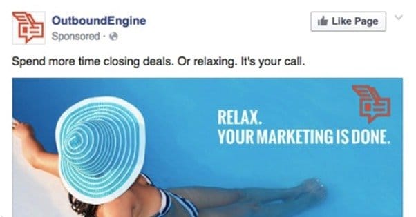
This ad is all about promoting the kind of relaxation you can feel when a tough responsibility is passed out of your hands and into those of someone who is exceedingly capable at their task. Or, in this case, automating it in a foolproof manner. The image itself is a woman – attractive to start – clearly enjoying herself in a clean pool.
I have two gripes with this image. The first is the primary color, which is obviously blue. Facebook is largely blue and gray, and while the blue of Facebook is darker than the blue of this ad, it still has a slight blending effect that makes you more likely to pass over the post if nothing else catches your eye.
My second gripe is how their orange logo looks like a muddy brown in the upper corner, though that may just be a side effect of the compression inherent in taking screenshots and re-uploading them. The original may have been cleaner.
6. TruthFinder’s Hint of Big Brother
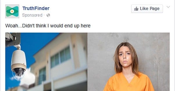
TruthFinder is a site for online background checks. Plug in a name and it will pull as much publicly available information as possible. The idea is to attract people to check up on people they know and are skeptical about, or to get people to check themselves and see what comes up. The site checks various state databases of personal information, traffic code violations, arrest records, and anything else it can publicly find.
The image casts all of this in a somewhat negative light. The camera image gives hints of “they’re always watching” in a dystopian sense, while the orange jumpsuit brings to mind images of jail and dark hidden secrets. The copy supports this with an almost clickbait-like description.
My main gripe with this ad image is that it’s actually two images. A broader image of the camera might have worked just as well, though the other half doesn’t stand as well on its own. It’s a good example of why you should try to pick a single picture, unless you’re doing a collage.
7. Upstart’s Picnic
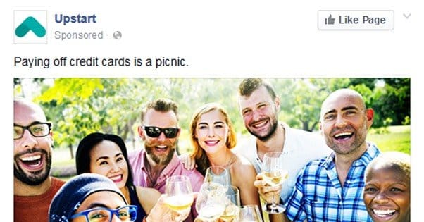
Upstart is a small personal loans company designed to help you pay off debts, except it doesn’t really do that. It just transfers your debts to them, presumably with a lower interest rate compared to the original servicers. They boast that they take more into account than just your credit score, to make estimates about your financial stability and risk. It’s a smart business plan, targeting millennials that are sinking in debt due to the economy, but have the potential to earn big in the future.
The ad image is interesting because it conveys none of that. It’s simply a play on the picnic concept mentioned in the ad copy. It’s a bunch of friends of a broad range of demographics – check out the racial and age diversity in that photo – enjoying a posh little picnic.
The image itself also hints at a lucrative future. These people are all wearing stylish clothing, they’re all (reasonably) well groomed, and they’re all holding fancy crystal goblets filled with what is presumably champagne. It all hints at a millennial’s impression of financial stability, even if the goblets are plastic and the champagne is apple juice.
8. Litmus Makes the Impersonal Personal
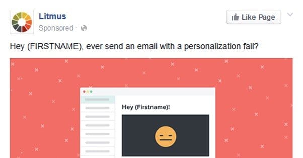
The subject of this ad is not actually the business itself, but rather an ebook they’re promoting. The copy is good, but the image seems to have little to do with it, beyond the headline in it. So what gives?
This image is good in my mind because it’s simple, stark, and colorful enough to stand out in the Facebook feed. Remember how I griped about too much blue? A good salmon pink is a great color to contrast. It’s a nice little illustration, and it also makes me think that the ebook they’re giving away will also include such simple, cartoonish illustrations. I don’t mind it.
9. Farmgirl Flowers’ Flowers

This is another one of those ad images that on its own doesn’t really have much to do with most businesses, but becomes incredibly relevant when you realizes that it’s advertising a company that provides flowers. It’s a beautiful flower display, and while it might not have much to say graphically, it’s still a bright and colorful image to attract attention.
That’s important about this image is that it’s one of the examples Facebook uses to showcase good ad design. You can see it in context – and the dozen or so other examples Facebook uses – in their ad image inspiration gallery.
10. AdEspresso’s Beauty
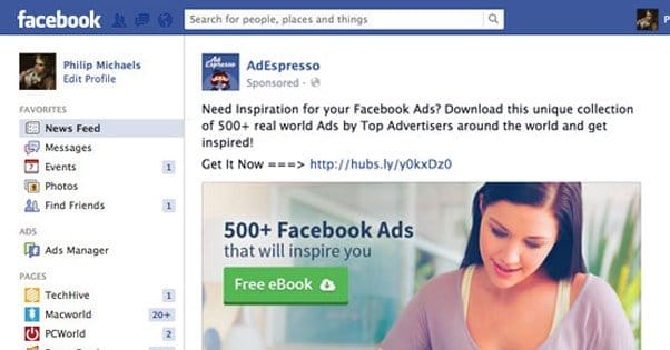
AdEspresso has spent a lot of time optimizing ads over the years, and as such they have compiled a huge list of ads that inspire you for your own. They then made ads to promote the ebook containing that list, because of course they did.
The interesting thing to me about this ad image is the one they compared it to, which you can find here. I actually like the second one, though the blue turns me off a little. It had more than double the cost per action, though, and the reason is simple. The expensive one has a cartoon logo man, while the cheap one has a pretty lady showing a smidge of cleavage while she works. It’s not designed to be sexy or exploitive, but it’s still featuring a smiling, pretty woman, and that’s one of the things that demonstrably sells, time and time again.
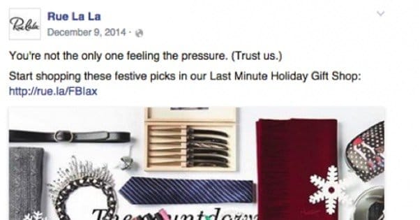
11. Club W’s Holiday Spirits
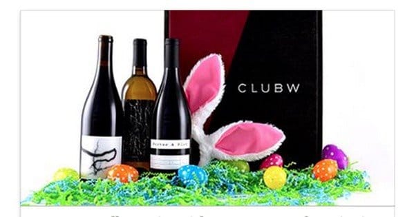
The image for this one says it all. It has the name of the brand, Club W, on a nice, posh-looking box. It has three disparate bottles of what can be assumed to be wine given the context, showing a broad taste and selection. It has Easter holiday decorations strewn around tastefully, not obscuring, but adding color to what would be an otherwise drab primarily-black image. It has a white background to merge with the post background as well. Overall, it’s a good, serviceable, illustrative picture.
12. Zimbio’s Teen Dream
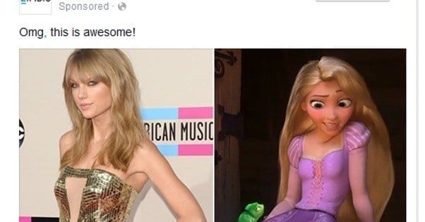
This ad has a little of everything in the image. It has a pretty woman, in this case a celebrity, and a CG pretty woman, in this case from Disney. It’s not a before-and-after, because it’s not trying to sell something that promises to transform you. That would be against the ad terms of service. Rather, it promises to show you the work of an artist who uses Photoshop to turn celebrities into Disney characters.
This ad image is a good choice, but the ad itself could use some work. I would like to see an example of the artist’s work, but they probably didn’t have permission to use it, and so can’t use it to advertise. The ad copy also is too short and is truncated, and the “learn more” is a bit formal for the informal nature of the article. No thank you, I don’t think I will be clicking this today.
13. Google Being Google
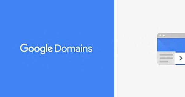
Now for an example of an ad I really don’t like. This is legitimately a sponsored ad by Google. Yes, Google, using Facebook ads. It’s a carousel ad, but it doesn’t use the space well at all. Here’s what I see wrong with this ad:
- The primary image is boring. Really boring. Yes, Google, I know you’re going for your trademark minimalism but a plain blue box on Facebook is basically the least visible thing you could do.
- The secondary images are even more boring. They’re nothing but gray boxes with logos for their other services.
- The picture captions are boring. “Get your domain now.” Okay? Like, I can do that anywhere, you’re not selling me on it. “Custom website.” What? With a design like that? I don’t trust you to design a business card. The next one over with the Gmail logo just says “Professional email.” You are not screaming professional to me, Google, you’re screaming boring.
- The top copy says to look great online, use their services, and then they follow it up with the most boring ad I’ve ever seen. What even is this?
If it weren’t for the fact that this is a verified account for Google advertising, I’d suspect it was an impersonator. It’s just proof that Google is too big to bother caring about advertising to the little people.
14. Get It Free
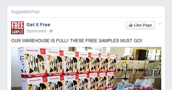
“Get it free. It’s free. Get it. You can get it free. What is it? Get it free. You can get it free if you want. Free samples, in the mail. They’re free. You can even get it free. Just tap here. If you tap here you can get it free. It’s free, completely free, for you to get. It’s free real estate. Come get it, free.”
This is the kind of spammy, exploitive Facebook page that deserves to be banned, and it’s an illustration of what you shouldn’t do. For one thing, the business such as it is is clearly a scam. Secondly, the ad copy is all in caps, a big no-no. The spacing on F R E E is against the Facebook terms for ads. It has a “tap here” button on a desktop ad, so they aren’t segmenting between desktop and mobile. It’s dreary, like they claim it’s a warehouse when it’s more like a diner. Plus the wall of big boxes of Kitchenaid products is skewed and clearly photoshopped in, poorly at that. There’s also no “sample” you can get of a Kitchenaid product, you either have one or you don’t.
15. Better You’s Clickbait
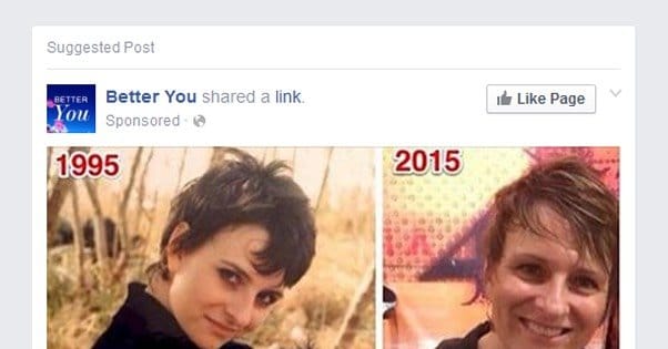
This is the very definition of clickbait, in every possible way. The headline is obviously clickbait, engineered to make you curious about what is being hidden. The images even hint at a dark hidden trait. You have a before and after comparison, and everything is positioned to go downhill. You have the glamorous woman looking much more bedraggled, and you have a red-faced baby that presumably grows up to look different. How different? Who knows! You have to click to see. No thanks, I think I’m done with Facebook for now.

