 Written by ContentPowered.com
Facebook images for posts – and promoted post ads – can be a complicated matter. A lot of people just ignore it entirely and let Facebook pick an image, but you’re a serious marketer. You’re not going to leave anything to chance. You want to test and optimize everything you can, and images are near the top of your list. They’re big, they’re visible, they’re vibrant and they’re important for attracting the attention of your audience.
You’ll probably quite quickly run into a common issue: Facebook sizes images in different ways depending on their purpose. That means they have a chart of recommended sizes, but the actual images on display end up somewhat smaller. Worse, if you use the wrong ratio for your image, it can look stretched or skewed. So, you know, a question that should take 100 words to answer ends up with a full blog post dedicated to it. Let’s examine further, shall we?
Images in Posts Versus Other Images
Before we dig in, I’m going to clarify what precisely we’re talking about; post images. That is, images in the preview for a post to your news feed, or for a promoted post with an ad objective attached. I’m not going to be talking about your profile image, your cover photo, your picture posts, or your sidebar ads. There’s already enough to talk about with just this one type of image, it just gets messy to include the rest. I will, however, also be including mobile versions of your posts.
There are several different image sizes across multiple ad objectives, so this is a more complex issue that you might think. I recommend making a template or downloading one online, so you have borders and sizes to use to frame your images. I also recommend testing your images before you upload them. When Facebook recommends an image be 1,200 pixels wide, but only displays them with 400-something pixels of width available, that makes for a squished picture.
You need to make sure any fine details are either visible or unnecessary. More importantly, you need to make sure any text you include is still readable at the smaller size. I can’t tell you how many times I’ve seen people make a perfectly readable image that, when sized down, became a compressed mess.
Recommended Dimensions
Here’s the list of dimensions Facebook says are recommended for post images for various objectives. I’ll list the objective and the size Facebook recommends you use. Keep in mind, though, that these images will be scaled down. The next section will cover what the actual display size will be.
- Website Clicks: 1200 x 628
- Website Conversions: 1200 x 628
- Post Engagement: 1200 x 900
- Page Like: 1200 x 444
- App Install: 1200 x 628
- App Engagement: 1200 x 628
- Local Awareness: 1200 x 628
- Event Response: 1200 x 444
- Offer Claim: 1200 x 628
- Video View: 1200 x 675
You’ll notice here that the majority of these will be your traditional rectangle, about twice as wide as it is tall. Some others, like the event response, have a particularly short image, whereas post engagement has the closest to square image out of all of them.
One other thing to note is any ad that uses the multi-image carousel recommends that each image be 600 x 600, i.e. a square image. You will need 3+ images for the carousel to be most valuable. If you’re not sure what the carousel format is, read more about it here. The third image you choose will only display a sliver of the left side to entice people to scroll, so make sure there’s nothing untoward displayed out of context there.
Personally, I like the idea of carousel ads, because you can do some fun things with the scrolling images. That sliver can have some amusingly meta content. I think it would be great for a pet store to have a dog or cat peeking a head around the corner, so to speak. Of course, I’m sure it’s been done, and even if you’re thinking of doing it, don’t just take my word for it being great. Test it out, make sure it works.
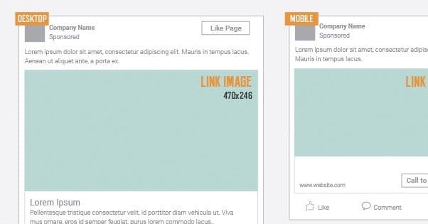
Display Dimensions
This is where things get complicated. All of those numbers above are just what Facebook suggests you use for image sources. You’ve probably noticed that the actual news feed is nowhere near that wide. I certainly have. If you get rid of the chat system on the side, on a normal widescreen display, 50% of the screen is just gutter whitespace. Come on Facebook, people aren’t using CRTs anymore, we have actual resolutions. I imagine on a 4K monitor you’d have to zoom in to even be able to see Facebook, it makes such poor use of space.
For this section I’m going to do the same thing I did for the previous section, but I’ll also be noting the mobile size as well. Often times, the mobile display size will be different, though it’s often a hair larger. This is because the mobile Facebook design eliminates all of the unnecessary sidebar crap and streamlines the feed, so it can take advantage of the full width of the browser.
- Website Clicks and Conversions: Desktop 470 x 246, Mobile 560 x 292
- Post Engagement: Desktop 470 x 470, Mobile 626 x 840
- Page Likes: Desktop 470 x 174, Mobile 560 x 208
- App Installs: Desktop 470 x 246, Mobile 560 x 293
- App Engagement: Desktop 470 x 246, Mobile 560 x 293
- Local Awareness: Desktop 470 x 246, Mobile 560 x 292
- Event Response: Desktop 470 x 174, Mobile 560 x 208
- Offer Claims: Desktop 470 x 246, Mobile 560 x 292
- Video Views: Desktop 470 x 264, Mobile 560 x 315
Additionally, the 600 x 600 carousel ads? They display as 200 x 200 on desktop, and 460 x 460 on mobile. So you can see why clarity is important; when the image is a third the size of the image you upload, you can’t afford thin lines and tiny details.
Skirting the 20% Text Rule

When you post a link organically on your page, you can do whatever the heck you want with your image. You can make it a zebra in a tutu reciting the works of Shakespeare. You can have it be nothing but a typography showcase. You can have it be a nice scene of a city skyline at night. The only restrictions are those on all content on Facebook; that is, no pornography, no nudity, no hate speech, no racism, that sort of thing.
Once you convert your post into an ad, though, you suddenly have a handful of restrictions above and beyond the normal Facebook restrictions. I’ll cover the content restrictions in the next section, though; this section is dedicated to one and one of them only. That one is the 20% text rule.
The 20% text rule is a rule that your ad cannot have more than 20% of its surface covered in text. This excludes unreadable background lorem ipsum, but it does not exclude promotional text, including textual logos and general sales speech.
The thing is, the way Facebook determines text percentage is oversimplified, and it leads to a lot of little quirks in the system. See, what they do is use a grid tool. They divide the image up into a 5×5 grid, stretched to fit whatever image you use. You can use a public version of their tool here. There are also third party versions of the tool available here and here.
Once your image is uploaded, you need to manually click on each box that contains any text. However, Facebook is very quirky about it. If your text has an I with a dot that floats up above the line and into another box, you have to tick that box. If that box is your sixth box, that means you’re over 20% text. See, each box is worth 4%, regardless of how much or how little text is in it. One box packed full of text, and one box with just the lower part of a J, are worth the same amount.
You would think this is just an estimate, and you’d be okay with what would effectively be 20.01% text, but you’d think wrong. Facebook either uses a robot or uses humans with very strict guidelines to perform this overview. That hovering I or dipping J can get your ad rejected, and the solution can be as simple as sliding the text up six pixels or changing your font size to be slightly smaller.
One single three-word sentence, at the right vertical position, could take up as little as three boxes. Raise it a bit and now it’s taking up six boxes, which suddenly is 24% text, which violates the rule.
I really recommend using one of these grid tools to estimate how annoying it will be to get your ad image past the censors. It’s just needless hassle to ignore a preventative measure and get your ads rejected.
Oh, and in case you thought it was still a sensible rule with inconsistent enforcement, just remember that sometimes it won’t even count some text. If your logo is made up of words but they’re sufficiently stylish, like Jon Loomer’s logo, it won’t count. You can see his analysis of it, using his own ads, in this post. You can see both the three-word-six-box thing, and how certain bits of text don’t work. It honestly makes me thing there are humans with inconsistent training working on the system, probably freelancers under NDA who get paid pennies and live in Bangladesh. Nothing against Bangladeshi businessmen; it’s just the sort of thing Facebook would do.
Image Content Restrictions
There are a lot of prohibitions and restrictions on the content you can have in your ads, both in your copy and your images. Only some of these apply to organic posts, but given that you can convert posts into ads by boosting them, and given that you’re a business looking to promote yourself on Facebook, it’s probably a good idea to follow them all regardless. Facebook enforcement can be fickle at the best of times, and you have little recourse if Facebook takes action. They’re not known for rescinding judgment.

Prohibited: Your ads cannot promote, condone, or facilitate illegal products, services, or activities. You can’t target minors with ads that promote products or services that are age restricted. You can’t exert undue pressure on those age groups, nor can you exploit or mislead them. What does that mean? Don’t exploit minors or pressure them to do something against their better judgment.
Prohibited: The content that is prohibited – as applies to the above – is as follows:
- Any illegal drugs, recreational drugs or drug use, or prescription drugs. Put down the pharmacy website folks, Facebook isn’t the place for you.
- Any tobacco produces or accessories, including hookahs, pipes, and other paraphernalia.
- Any supplements that Facebook deems unsafe. Generally these include supplements and poultices that the legal system has deemed dangerous, like “Black Salve”. Don’t, uh, don’t Google that unless you’re willing to see pictures of people with their flesh eaten away by a corrosive cream sold as a skin cancer cure. Steroids and growth hormones tend to fall under this heading as well.
- Any weapon, any ammunition for a weapon, or any explosive. Explosive covers fireworks, by the way, so even if you’re a vendor of legal fireworks in your state, Facebook won’t allow you to advertise them on their site.
- Any adult products or services. This includes sex toys, adult magazines, erotic services, and the like. The exception to this is family planning and contraception, as these are more considered health and wellness than they are sexual in nature.
Prohibited: Ads must respect the community standards. That means your ads can’t be direct threats against anyone or anything. They cannot promote self-harm. They cannot promote dangerous organizations or hate groups, including the KKK and ISIS. They cannot promote harassment or be harassing themselves. They cannot attack public figures. They cannot promote criminal activity. They cannot include nudity or graphic content. They cannot promote fraud or spam.
Prohibited: Ads cannot infringe upon the rights of anyone. This includes copyrights, trademarks, privacy issues, publicity and other personal rights.
Prohibited: Ad images cannot use explicit or suggestive images. No matter how tastefully cropped, pornography is still pornography, and the setting alone is often enough.
Prohibited: Ad images cannot use implied or actual violence. No images pointing a gun at the reader, no graphic images of car accidents, no broken bones or other gore, and nothing that could be considered a shock image.
Prohibited: Ads cannot reference personal demographic information. Sure, you can target explicitly African Americans, but you cannot use text that encourages them to “find other black folks locally” or anything of the like. The same goes for other demographics, including religion, age, sexual orientation, financial status, criminal record, name, or other affiliations.
There are other tertiary reasons an image might be denied approval, such as “before and after” image comparisons, images that include elements that imply nonexistent functionality – like a video play button on an image ad – or ads that lead to non-functional pages.
On top of all of that, you have restricted content. Alcohol ads are allowed, for example, but only using the specific alcohol targeting, which restricts audiences by age according to local laws around the world. Dating sites are allowed, but only with prior approval from Facebook. Gambling sites are allowed with written permission from Facebook. Lotteries are allowed, but only when they are state lotteries, only when the advertiser is the state entity itself, and only when the targeting is restricted to state residents. Subscription services have a bunch of specific regulations to follow as well.
As if that wasn’t enough, your ads need to be relevant to your business. If you’re a site selling eyeglasses and contacts, you can’t publish an ad promoting pet food, no matter how cute the picture of a kitten you use happens to be.
