 Written by ContentPowered.com
![]()
You know me; I like to take a simple topic and cover it in far, far more detail than is necessary. That’s what I’m going to do with this one, so strap in kids, and prepare to learn far more about Facebook’s font and social media typography than you ever wanted to know.
Facebook is an interesting case, because their font looks generic enough that it can match several different fonts. Up until the middle of 2014, they used a font that most people identified as Klavika Bold. If you compare it to the logo they use now, though, you’ll see some differences. The new, current font looks almost the same, but has slightly different kerning and angles on some of the letters.

The new font does not have a name, at least externally, as it is not externally available. It was developed in-house with input from Eric Olson, from Process Type Foundry.
Therefore, you cannot officially download the current Facebook logo font. The closest would be Klavika Bold (linked above). If you are a talented graphic artist, you could make a few modifications to get it very close to their official font.
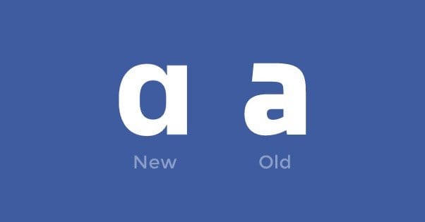
The biggest difference between the old and new Facebook font design is the type of A it uses. Before, it had the little hook over it, as is typical with many fonts. The new a does not have that hook. The version with the hook is called a double-story a, while the version without is a single-story a. One interesting tidbit of note is that the official font designed for dyslexic users has a double-storey a, indicating that Facebook’s change made their logo slightly less readable for such users. Not that anyone has a hard time identifying the Facebook logo, dyslexia or not.
As for the font they use for their actual social media site text, it varies from platform to platform. On PCs they use Tahoma, while on Apple computers they use Lucida Grande. iOS mobile devices use Helvetica Neue, while Android smartphones and such use Roboto. These fonts are sans serif, which indicates that they don’t have all the extra frills, or serifs, that come on more complicated fonts. Times New Roman is the prototypical serif font, while Arial is the standard sans-serif font.
In case you were curious, by the way, Facebook makes use of five different shades of blue throughout their site design and their marketing materials. These five are hex values 0e1f56, 3b5998, 6d84b4, afbdd4, and d8dfea, from darkest to lightest. The most commonly known Facebook Blue is the second one, 3b5998. You can, of course, sample any color on the site simply by taking a screenshot of your browser and opening it in an image editor. Even MSPaint has an eyedropper tool these days.
Twitter’s logo doesn’t often include their name spelled out in a font, but when it does, it’s made of large, gently rounded letters with nary a serif to be seen, which means the exact font isn’t officially available either. They haven’t changed their font in quite some time, either. However, the logo font you can use to replicate it is the Pico Alphabet font, which is almost identical. It was created by Maniackers Designer, which you can find hosted on this site. Warning: the site is largely Japanese.
This isn’t exactly a match for the Twitter logo, unfortunately. The e isn’t a perfect match, and the t doesn’t stretch out quite far enough. You can see a comparison between the two on that site, even. That said, it’s close enough for almost any use.

As for the display font on their site, you can see it – as well as logo guidelines and other brand management tips – on their brand assets page. They quote their font as one of the Gotham fonts, specifically Gotham Narrow SSm. Some claim they have changed to the same Helvetica Neue that Facebook uses on iOS, but others disagree. You can always take a screenshot and use a program like What The Font to attempt to identify it yourself.
Twitter specifies five colors – plus white – that they use throughout their site. You have the blue 55acee, the almost-black 292f33, and three grays, ccd6dd, 66757f, and e1e8ed. Again, you can sample them yourself to confirm.
One thing to note is that Twitter has specific rules for how they allow others to use their logo. You’re not allowed to change the angle or direction of the logo, you can’t surround it with other animals, you can’t add speech bubbles or change the colors, and they don’t want you to anthropomorphize it. Of course, I’ve seen pretty much every single one of these done by someone somewhere, but those are the guidelines Twitter puts forth for anything official.
Google+
As you might expect, Google – makers of Android – use the font they put in Android as the standard sans serif font. That font is Roboto, specifically Roboto Medium for their various sign in buttons. Interestingly, Google doesn’t like people using the phrase “Google+” for their social platform. They prefer that you use the G+ logo with the word “Google” on its own. Google provides the font, as well as tons of guidelines for how to use their buttons, font, and everything in their Developers section.
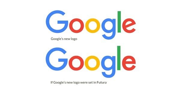
If you were paying attention to Google-related news last year, you may have noticed that Google changed their primary logo font back in September. They had a robust, thick font and logo, but they changed it to a vastly simplified version. Their reasoning, they say, is because stray pixels, serifs, and complicated forms can get muddy on small devices. Because so many people are using mobile devices and small screens these days, ranging from tablets to smart watches, they needed something crisp and clear.
The font they chose looks a lot like Futura, but Futura is actually a bit different. For one thing, Futura is based on perfect geometric shapes and right angles, while the new Google logo has a slanted e, among other things. The l is also a little shorter. You can see a direct comparison here.
The font is a spin-off of their Product Sans font, which they use for all of their related properties. This font also uses the double-storey a, presumably to avoid having a and other similar letters looking the same on small screens. As interesting as Google Mops might be, I don’t think anyone wants to mistake it and Maps together, you know?
As far as colors go, Google+ has a small selection. They don’t need to bother with several different shades. They have a red, a light gray, and a dark gray. The red is d34836, the dark gray is 2d2d2d, and the light gray is d2d2d2. This just goes to show you how much precision Google puts into their code.
Others
Reddit isn’t known for its typography, and in fact the font they use on their site changes from sub to sub as different subs customize everything for their users. Reddit users are notoriously difficult about fonts, too. A year ago the site increased the default font size across the site, and Redditors collectively went ape over the change.
As for their logo, they use VAG Rounded Light. It’s a very thin and normal font in every way, further cementing how Redditors like to feel special despite being one of a collective community of hundreds of millions. Reddit only has three colors they use by default, the red ff4500, the blue 5f99cf, and the light blue cee3f8. Again, though, different subs can have different designs.
Pinterest is an interesting one because their logo doesn’t actually have a font. Prior to their redesign in 2011, they used Bello Pro, which can be found here. Since then, though, they have used a custom logo design that uses lettering for the logo without a font. There’s no one font you can take to write in “the Pinterest font” though. The main reason for this is so it can have the cursive look of connected letters done properly. You can see this in the es and ts of the logo, which look different between the two of each of them. The Pinterest logo was designed by Michael Deal and Juan Carlos Pagan.
Contrast this with the Instagram logo font, which emulates a cursive look without actually connecting most of the letters. This is because it’s easier to make swirly looking letters without worrying about how they organically connect. The font Instagram uses is Billabong, which can be found here. Unlike most of the other fonts on this list, you need to pay a license fee to purchase Billabong. It’s not cheap, either.
The Tumblr logo has been some variation of Bookman Old Style since the day the site was founded. Today, the T still looks the same, but the U has received a little modification. Interestingly, the Tumblr asset guide has some useful information. They allow color customization as much as you like, and allow putting the logo over photos and in different containers. It’s much more flexible than other social networks.
As one final note, you should always be careful about emulating a social network’s font. A lot of these networks don’t really like when people use their fonts. You’re typically only allowed to use specific marketing materials and in specific ways, as specified in these asset guides I’ve been linking and referring to. If you’re using logos in unauthorized ways, you’re going to run into trademark violations, particularly if you’re using one of their fonts in your branding. Under no circumstances should use try to incorporate their logo or font into your own.