 Written by ContentPowered.com
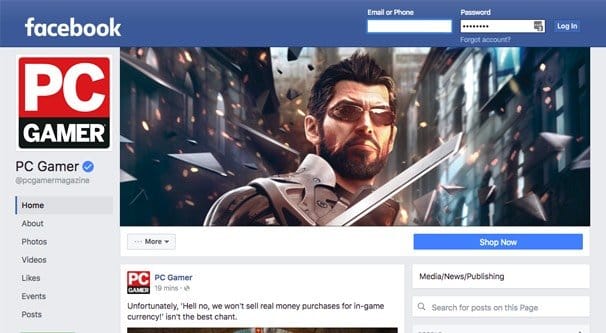
If you’ve been a diligent browser of pages on Facebook recently, you may have been noticing a trend where they slowly roll over to a new layout. If you haven’t caught it yet, you can see it live here.
The first thing you might notice is that it has gone back to a “three column” design, though the previous three column design had two streams of posts and one of information. This one maintains the singular feed of posts and has two informational columns.
Starting in the upper left, let’s look at what we have.
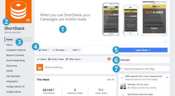
The Profile Picture
The new profile picture is not laid over the top of the cover photo. Instead, it hovers in its own white box with as light single pixel shadow, looking sort of like a sticker on top of the page.
The new profile picture – or logo image, as it’s called for pages – is displayed by default as a 160 pixel square. Facebook themselves recommend it should be uploaded as, at minimum, a 180 pixel square, which is then slightly downscaled. This is still the same as it has been for past iterations of the layout, where you can use much larger images if you want, and they will be scaled to fit.
The Page Name
The page name is now displayed in large black text underneath the profile picture. There’s not actually a lot of horizontal space here, and a longer page name will wrap, rather than expand the size of the column. For example, this page has their page name wrap across three lines. I’m not sure how it wraps if one single word is longer than the horizontal character limit, which appears to be about 13 or so letters long.
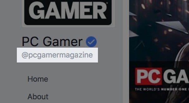
Beneath the page name is the page username. Facebook has been rolling these out slowly. They take your page username and put the Twitter styled @ in front of it. PC Gamer’s page username is PC Gamer Magazine, or pcgamermagazine, which becomes @pcgamermagazine with Facebook’s new system.
If you’re building your social media presence from scratch today, I highly recommend trying to match the username on both platforms. If you’re in a position to change your username on either platform to make it match the other, it might be beneficial to do. This is all because Facebook is stealing the @username format, which until now was solely used by Twitter.
The Tab List
Beneath the name and username for the page is a list of tabs. These were formerly split into two sections, one along the top under the cover photo, and one down the side of the page in a scattered handful of windows. Now they have been aggregated into one list. Yes; this is your tabs list.
The Facebook tabs list contains both the standard tabs and any tabs you’ve added. On a blank, freshly created page – I have one set aside for testing – it will have Home, About, Photos, Events, Likes, Videos, and Posts. In your page administration window, you also have Manage Tabs, which allows you to change their order, add new tabs, or remove old tabs.
Tabs here can include custom tabs you’ve made over the years. ShortStack posted a screenshot of their page when they first noticed it, where they have a dozen more tabs than normal.
They are mostly demos of different apps you can make with ShortStack, so actually, why not check them out? They’re one of the better ways to make Facebook tab apps these days.
If you own the page, at the very bottom of this column will be the Promote button. Clicking it will take you to the promotions tab, which is a lite version of the ads manager and allows you to create a few basic types of ads, like basic page growth ads. In fact, it’s a sub-view of the new Facebook Insights, which has changed a bit on the back end as well.
If you do NOT own the page, instead there will be a green button at the bottom of the column which invites you to create a page of your own. Even if you own a page other than the page you’re viewing, this button still exists. Facebook is trying to get more people to use pages, I guess.
The Cover Photo
The new cover photo is large and in charge of the real estate on your page. If your users have smaller monitors or are operating at a zoom, it’s absolutely dominant.
The new cover photo dimensions are 828 pixels wide by 315 pixels tall. However, the left and right gutters of the image, 133 pixels on either side, are hidden on mobile browsers. This is because the inner section, the 563 pixels remaining, matches up with the width of the middle column of posts. Make sure to keep this in mind for your mobile marketing.
The CTA Bar
Beneath the cover photo is the call to action bar. Formerly, these buttons also took up screen real estate on the cover photo, so this move helps contribute to the less cluttered feel of the new page layout.
On the left side of the CTA bar can be either two or three boxes. The first is the like box, which is the “like this page” call to action. Hovering over this button allows you to like or unlike a page, and it shows you the notification status for your account as well. Users can choose the default EdgeRank display or choose to prioritize posts from that page in their feed. They can also choose receive notifications when the page posts or not.
Clicking the pen icon on the notifications box brings up a much more detailed box with notification options in much greater detail. A user can choose to see notifications for specific types of posts, like photos or links, notifications for events near their location, and other notifications for live video broadcasts through the streaming system Facebook has been using recently. The news feed display is the same as ever, though, either Default, See First, and Unfollow as the only options.
The second box may or may not be there; it’s the “message” box. If it exists, the page can be messaged directly through the Facebook messenger. If it does not, the page has that feature disabled.
The third box – or second, if the message box doesn’t exist – is the More Options box. This has “save page”, “suggest edits”, “like as your page” and the usual report, block, or share options. It also has another “create a page” CTA, proving that Facebook is really pushing people to make pages of their own. I actually wonder if Facebook is going to unify the design between profiles and pages and give everyone access to ads in the future.
Finally, off to the far right of the CTA bar, is the standard big page CTA. It’s a large blue button, in contrast to the white/gray buttons on the rest of the bar, and it really stands out. The button options include Book Now, Call Now, Contact Us, Send Message, Use App, Play Game, Shop Now, Sign Up, Watch Video, Send Email, Learn More, and Request Appointment.
One thing to note is that the back end displays haven’t changed for this yet. The display preview for changing the button on your page still shows the old page layout in screenshots.
The Middle Column
The middle column is simply a feed of posts made by the page. It hasn’t changed, with the exception of a prominent “this week” box of insights if you’re the page owner. This doesn’t appear if you don’t own the page, so don’t worry. The box appears below the create a post box, but above the feed of posted posts.
The Right Column
This column is somewhere in the middle in terms of width; the middle column is wider since it’s the posts, the main focus of the page. The left column is narrower, since it’s limited to just text and doesn’t need to cover a lot of space.
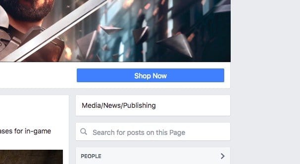
At the very top of this column is a new box that includes the business category of the page. This is simply a reflection of the category you picked when you made the page.
Beneath the category box is a search box, that allows users to search through the posts you’ve made on your page to find one specific piece of information. This is pretty useful for some users and will be completely ignored by most.
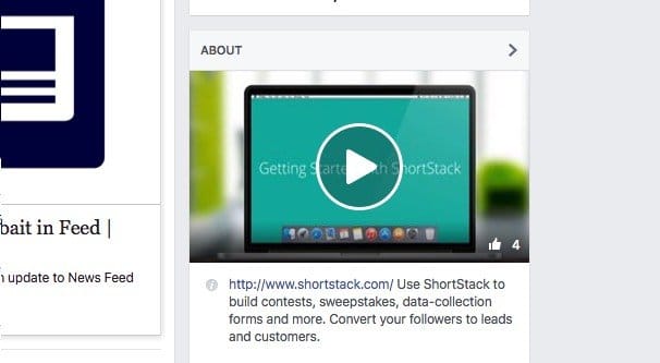
Beneath that is the About section. Different pages will have different pieces of information here. PC Gamer has the number of likes and their website URL, but nothing else. By default several of these forms – address, phone, hours of operation – are there, but turned into message links. ShortStack has a preview video – very cool – a text bio and a response time for messaging them.
If you’re the owner of the page, you will see some Insights information here instead. You’ll see your response time, your likes and growth, your weekly reach, page feed, and an invite friends box.
Beneath that can be an array of different app boxes, much like that used to appear on the left side of the main column in the old layout. PC Gamer, for example, has photos, videos, and a feed of other pages liked by their page. ShortStack has their Apps box up above photos, and also includes Notes and Visitor Posts below the Videos box.
The Tab Apps box is still the old legacy tab apps box, with the preview images for the apps as well, so this makes it more attractive than the list on the left.
One note is that all of these apps are accessible and visible on the left list, so the right side list is redundant. Things like Notes and Visitor Posts can generally be left out of the feed entirely, and the only reason to include Photos and Videos is because you have to. Make sure to make them pretty, at least.
Mechanics
The way the new layout works is very dynamic. When you load the page you’re at the top, unlike Twitter and the personal profile view, where you start scrolled slightly down so the cover photo is slightly obscured. When you scroll down, the left column is “sticky” and follows you down. If you have enough items in the list, it will scroll to the bottom of the list and then be carried along as you scroll down the feed. When you scroll back up, no matter how low you are on the page, that column scrolls up immediately to the profile picture and carries along.
The right hand column does the same thing, but since it’s generally going to be much longer, you have to scroll quite far before scrolling up doesn’t reverse its flow immediately.
The feed, of course, is the central focus of the page, and thus is the focus of the scrolling. It works as you might expect, being the core of the page.
Mobile Views
Mobile is interesting. Take the PC Gamer page for example. If you click on their cover photo, you see that it’s actually taller than it looks. This image has a darker lower section, which is visible on mobile but not on PC. However, it’s also slightly truncated and slightly faded, so the text at the bottom is difficult to read.
Beneath that are the profile image and CTA box mashed together, and below that are the common tabs, like Home, Posts, Photos, Videos, and Events. Then comes the videos box, which scrolls to the side, then the photos box that does the same, then the informational box. Only after all of that – or if you tapped the Posts option – do you see the actual posts of the page. None of the sidebars exist, of course. This was tested on Android, though I assume iPhone is very similar if not identical.
Have you noticed any changes I didn’t? Feel free to point them out.
