 Written by ContentPowered.com
I get this question a lot, pretty much every time Facebook changes anything, anywhere. It’s amazing to me just how much people hate and fear change. Even if the changes are barely noticeable, there will always be someone out there complaining about it. You can see page after page, thread after thread on site after site, all complaining about the new layout.
Here’s a fun game you can play. Whenever Facebook makes a major change, go to their support forums and look for threads like this one. Browse through the answers and look for people saying things like “I hate this design, I won’t be using this site much longer.” All the people who claim they’re going to leave Facebook because of the design changes and are vocal about it. What’s the game? Click through to their profiles and see how active they are. Did they really quit, or are they just whining? Most of them, you’ll find, are just complaining because new things are scary.
No offense if you’re one of those people, obviously. You’re just curious, is all. Is there a way to go back to the old Facebook page layout?
Which One?
2004 – Is it this layout is the original, as-created Facebook, back before it was even known as Facebook. You can even see in the screenshot how it was limited to a certain selection of colleges. Not enrolled in one of those colleges? Sorry, you’re out of luck.
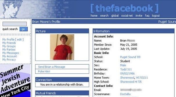
2005 – How about this one? The site is a little more public now, but it’s still TheFacebook, and it’s still very unlike what you see online today. Despite being from a mere 11 years ago, it looks and feels more like something from 1997.
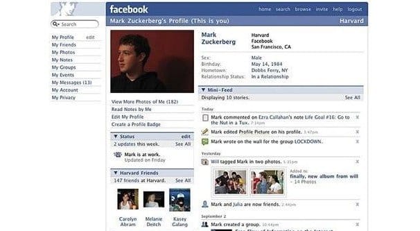
2006 – Or maybe you prefer this one, which is a little more modern, and they finally dropped the “the” from the front of the site name. It has a nice vertical picture front and center, and you can forget about a personalized news feed; you’re looking at college networking and a page absolutely covered with personal details. Hope you don’t have a stalker!
2007 – Oh, maybe it’s this one! This is the one where they finally opened up to people not currently enrolled in a college. Your parents can join now! There’s even the mini-feed, displaying a handful of hyper-local stories about groups and photos. It’s the earliest prototype of what we current have, after all. Maybe that’s what you’re nostalgic for.
2008 – More likely, it’s this one. This is where they pulled your profile information off to a separate tab and gave the site’s focus over to THE WALL, which today has been torn down and left as the ignored and maligned activity feed. Did you even know there’s still an activity feed? Turns out maybe the features you like in Facebook are still around, eh?
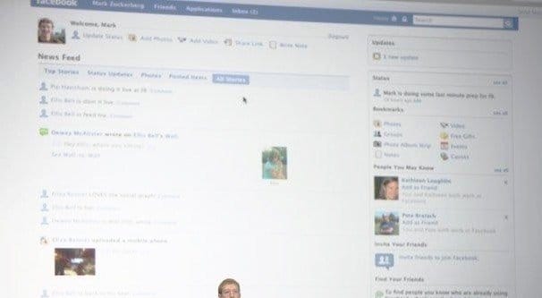
2009 – Rolling out redesigns like clockwork, Facebook revamped the entire site once again to give you a homepage with a news feed on it. That’s what you want, right? A nice informational bar off to one side and a feed full of baby pictures and likes front and center? I know that’s my favorite.
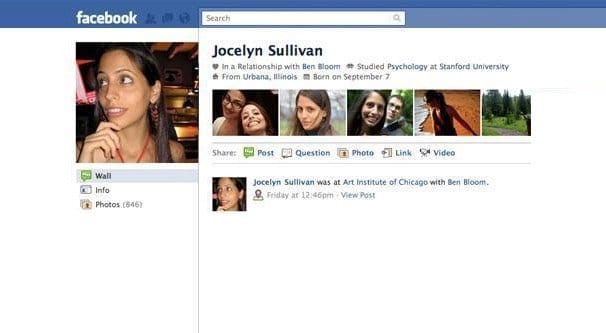
2010 – This update swapped around the sidebar and gave you a nice feed of photos across the top of your page. That’s pretty cool, right? Of course, Facebook eventually acquired Instagram, and now you can put all of your selfies up there instead. Or not, put them anywhere you want, I’m not your mother.
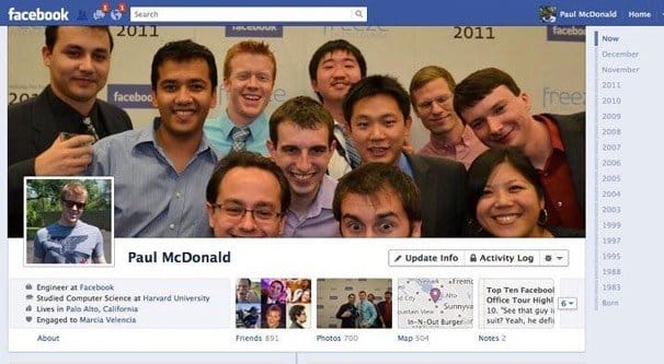
2011 – Maybe you’re a fan of the big cover photo. I like it, because it’s fun to come up with interesting ways to integrate the cover photo and the partially overlaid profile picture. Many current users will remember this layout, actually; we’re getting into the kind of layouts Facebook has been working on improving.
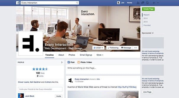
2013 – Minor updates in 2012 all culminated in 2013 with this much more modern looking layout. Large images, apps that work and display in the timeline, and a much greater focus on imagery bring it closer to the feel of the site as we have it today.
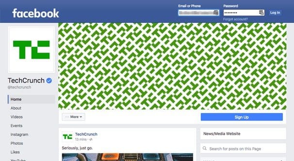
Then that brings us to this month, with the slow rollout of new pages and who knows what other features. They look slick, and sure, they’re different. The question I have to ask you is “who cares?” Facebook users aren’t going to go away because the page design changed. They aren’t going to boycott your page until you change back. Your functionality hasn’t changed, either. Everything you could do before is still there, though some things are in slightly different positions or locations.
People love writing articles about how Facebook has changed, but the more things change, the more they stay the same. Facebook is keeping their site from feeling stale. They’re making businesses shake thing up, to jar them out of their ruts. They’re making the average user adjust their experiences, and that’s uncomfortable for a lot of people, but what are they going to do? Go back to MySpace? If anything, MySpace has changed even more radically in the intervening years than Facebook.
Getting the Old Design Back
So, how might you get the old design back? Let’s take a look.
The first result I’ve found is this video. It’s an old video about an old layout, from back before Facebook started ignoring people and just rolling out changes. Do you remember the time when Facebook actually asked if you wanted to opt in to the layout beta rather than just rolling it out on top of you? Me either, really.
A lot of people opted in and wanted to opt back out, which Facebook claimed was possible. Plenty of people then discovered that they had no idea how to do so. As it turns out, it’s a very simple button that’s not even hidden in the one primary drop-down box Facebook has. Of course, since it’s not a giant red button on the homepage, no one knew where to find it, and people had to make video demonstrations of how to get it.
Of course, that’s a video from three years ago. It’s also about a layout change to profiles, not to pages. It’s also about a change that you could opt into. None of that applies to the most recent layout change.
Another way to investigate would be, say, this page. It’s a page created to get people to protest Facebook changes, or some such nonsense. They want Facebook to listen to their whining about change, but with only 400 members, Facebook could delete all of their accounts and not even notice. Besides, you’d think if they could change it, their page wouldn’t be using the new design, huh?
Over the years, people have made browser extensions for Facebook to change the design and hide elements, restore old layouts, and other such changes. I haven’t seen one that works as of 2014, but that doesn’t mean they aren’t out there.
Browser extensions, even if you find one that works, only limit you. They have to load the new layout and somehow squeeze it into the old format, which doesn’t always work. When people adapt to the new one, incompatibilities will grow. Likewise, future updates will break the extension. You can bet the developers don’t care.
And in any case, if you wanted to display your page in the old layout to your followers, you certainly can’t do that with a browser extension. You’d have to make and maintain an extension of your own and get your followers to install it, and most of them simply won’t.
Useful Extensions
I’m going to go on a bit of a tangent here, because while there aren’t any good Facebook extensions to restore the old look of Facebook, there are a number of extensions that are actually good and useful. Maybe you could consider those as ways to improve your Facebook experience, rather than some longing for a site layout that isn’t as good as what they changed the site to use?
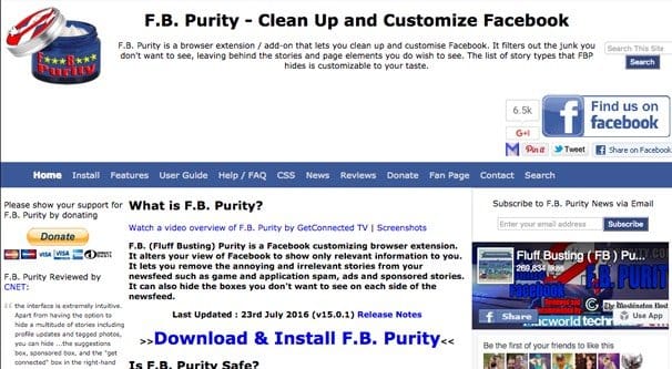
FB Purity – This extension has a ton of useful features that cut down on the hassle of using Facebook. Most of the features are either options in Facebook itself, or simple changes to site rendering.
- Disable video autoplay, so annoying videos don’t start playing when you happen to scroll near them.
- Remove the trending box, so you don’t have to be exposed to what Facebook considers “news” for you.
- Force the news feed to stay in “most recent” rather than Top Stories, which is Facebook’s filtered way of making sure you see as much advertising and as little friend and family posting as possible.
- Text filters to remove posts about topics you don’t want to see.
- The ability to hide just about any individual element, from the reactions bar to the security button at the top, to individual icons in the chat window, to parts of the sidebar.
Their list of features is huge, actually. I’m not going to reproduce it all here, there’s too much to cover. Suffice it to say that it will help make your Facebook experience much better, though it won’t change the layout to any significant degree.
Of course, this – and other layout changing extensions – are actually not allowed on Facebook. The creator of FB Purity was banned for violating the terms of the website, specifically some bit about not changing the way the site renders. I can see their reasoning – installing such an extension can make the site unsafe in obscure circumstances – but it’s a bit overkill.
Flatbook – This one is a pretty interesting extension that changes the layout and design of Facebook completely, making it a more modern-looking Windows 8 inspired flat design. Looks great on a tablet.
Photo Zoom – This is actually a pretty handy extension that essentially takes Facebook’s built in gallery display and strips out everything around it other than the photo itself. If you’ve ever wanted to click on a photo but didn’t want to see the profile, description, and comments that go along with it, this is the extension for you.
Social Fixer – Another extension very much like FB Purity, it has a ton of different options that allow various filters for posts, layouts, and aspects of the site. It also has themes to skin Facebook, though they only tend to change colors, not layouts.
Answering the Question
Alright, well, I never did get around to answering the question for you, did I? You want to restore the old layout on Facebook, now that they’ve changed to something new. Oh, and anyone visiting from the future; this is posted in 2016, but it will likely apply to any other update in the future.
Can you roll back or revert to an old look? No. No, you cannot. There is no way, either within Facebook or without, to change the look of your page in a way that affects anyone other than yourself. Your best bet is to install an extension to change the way you view Facebook and change anything you don’t like manually.






I got use to it to the actual news feed, but I guess it’s not our choice right? I can not stand the new circular size of the profile pictures. I would do anything possible to have the old square profile picture…
Hey Tony! It does make it rather difficult for some photos since so much get’s cut off on the edges… Facebook has been known to change the layout every couple of years, maybe they will bring back the square design in the future. We just have to wait and see. It’s square on mobile at least if you visit m.facebook.com.
I do not care about the layout, I just want my old facebook back. I messed it up bad myself by trying to set up facebook on my new phone.