 Written by ContentPowered.com
One of the most universally despised and reviled rules in all of digital marketing was Facebook’s 20% text rule. Facebook held this draconian policy in place for years, despite the inconsistent enforcement, and it drove marketers mad. It was easy to circumvent, since it used a grid tool with very large boxes. Jon Loomer shows you how text position – mere pixels up or down – would mean the difference between as much as 24% text and 8% text. One ad is rejected, the other is accepted, and here’s my problem; both of them have text in his logo and CTA button that simply don’t count. Except when they do.
The primary problem with the 20% text rule was not the ideal, but rather the execution.
It’s a worthy cause to try to minimize the amount of text in ads, because ads are meant to be quick graphics, not novellas. It’s arguable whether or not there’s a tangible difference in CTA between ads with more or less text, but I suspect it really depends on the ad and the execution. Still, the fact that Facebook chose to use an overly simplistic grid, to only count some kinds of text, and to enforce the rule on a sporadic basis, meant it was more of a hassle than anything. It was just one more entry on the “top 15 reasons your ads may have been rejected” lists, nothing more.
Facebook says that their data shows users preferentially view and click ads with less text. However, even their management realized that the grid-based solution was not a real solution. It caused stress with marketers, it was inconsistent, and it was riddled with problems. Rather than keeping an ineffectual roadblock in place, Facebook has decided to change up the rules and enforcement.
Why Prefer Low Text Ads?
The way I see it, there are two primary reasons that Facebook prefers ads with little or no text. The 20% threshold is simply a convenient number they could pick and enforce with their grid.
The first reason is because data suggests that ads with less text convert more. Facebook is in the business of pleasing its users, particularly its business users. Most of their policies are geared towards improving your ads by force, even if they have to drag you kicking and screaming to the point where they work. By enforcing little or no text, they increase conversion rates, lower costs, and make more money for both themselves and the advertisers on their platform.
The second reason is that it’s notoriously difficult to parse text on images. With text in a post, they can run it through any number of text filters to look for banned language, keywords that indicate a banned topic, links that are malicious, and so forth. An image that includes a URL is harder to check, and images can sneak banned language through the filters. By getting users to use less text, they minimize the amount of filtering they have to do.
Facebook’s New System
Now, don’t get all excited about the elimination of the 20% text rule and the grid tool. You can’t go out and make ads covered in text and expect them to run and work well. Facebook still wants ads with minimal text, and they’re going to enforce it somehow. The way they have chosen is simply a more automatic, scaled approach that doesn’t involve ad rejection.
Essentially, you are now safe from having ads rejected for having too much text. However, they will still be penalized if they have too much text, as determined by Facebook’s new automated scans.
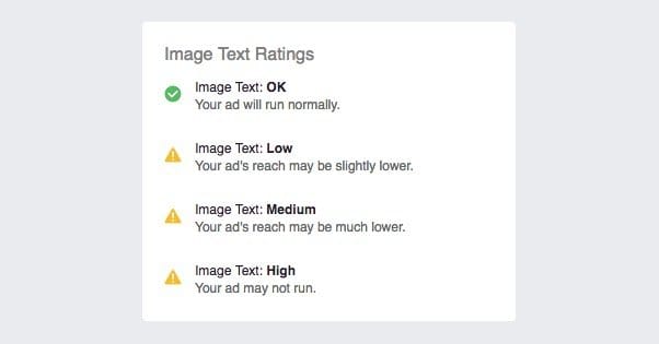
When you submit an ad, Facebook will scan it and break down the text density into one of four categories. High density ads are those with a lot of text on them, and are the worst as far as Facebook is concerned. Medium are better, Low are even better, and OK are the best. I can only assume, based on low-text being only “OK”, that an ad would have to reach out and remove text from other ads in order to be considered great.
OK ads will have little or no text in the image. However, you don’t need to get swamped down in details here. What Facebook counts as “text” for this purpose is generally CTAs and other pitch text. If your image is a photograph of a newspaper taken artistically, for example, it may be covered in text by technicality. However, since that text is not part of the ad and not a call to action for your ad, it doesn’t count. One of Facebook’s examples is a picture of a deli counter with a menu sign above it; lots of text, nothing counting as text for the purposes of their analysis.
An image that falls into the Low category is one that has some ad-related text on the image. Generally, this means a few words of CTA or description for your business. A logo may count, though Facebook has a logo flagged and a logo not flagged in their OK and Low examples, so it’s tough to say. Err on the side of less text by minimizing logos. Logos with symbols and no text are probably fine.
An image with Medium-ranked text is one that has either a lengthy CTA in the image itself, or includes a CTA and a motto or tagline. The example Facebook uses adds on to the Low category image by adding a brand catchphrase along with the logo. Generally, users are going to be aware of your brand motto already, if they follow you or are exposed to other forms of marketing from your company. You can get away with not including it on every ad. Save it for something like your cover photo, a pinned post, or your About section.
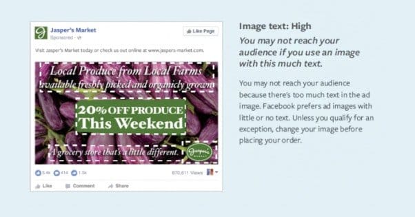
An image with high text is going to be flooded with more letters than image. Essentially, it draws away from the visual content of the ad by covering it with text. The example Facebook uses ups the ante by slapping a large “20% off this weekend” box over the top of the rest of it, leaving very little of the actual image in place.
You can see the examples I reference, as well as a few more, in Facebook’s original announcement for this change here. The announcement is from all the way back in April, but the change was limited to a few test users for months and is only just now being rolled out to the broader Facebook audience as a whole.
Exceptions to the Rules
Facebook understands that not all text us advertising text, and their algorithm – I assume with some human overview – will identify and flag certain uses of text as exceptions to the rule. An ad that would be firmly Medium with excepted text might actually be Low or OK, depending on how much of the text qualifies for exceptions.
What are some examples of exceptions to the text rule?
- Book covers. It’s hard to advertise a book without showing text on the cover of that book, so Facebook has an exception for book cover text, when the image is a photograph of the book. If your image is just a copy of the art and text, it may still be counted, as it’s no longer a book at that point.
- Text on products. Most products have text on them, like the name of the product, a tagline, a description, ingredients, and what have you. This text is an exception to the rule, as again, it’s hard to advertise a product without showing it.
- Legal text. If you’re advertising a medication and have to have a * with side effects, that legal text is unlikely to apply. Likewise, an ad that promotes a contest with a “terms and conditions” section on the ad, the footnote won’t apply.
- Text-based businesses. If you’re a company that sells calligraphic renditions of words, for example, you need to be able to show examples of your work without being penalized. Text-based business products are exempt, at least in terms of pictures of their products.
- Game screenshots. Apps that have text, even if the app is primarily text like a visual novel, won’t count against you. UI elements won’t need to be hidden or cropped out to meet standards.
There are, of course, exceptions to the exceptions. As Facebook states, any and all logos that have text will be considered text. A logo with a single script letter will probably pass, but a logo primarily made of text will not. One good example would be Coke and Pepsi. Pepsi’s swirled three-color logo image isn’t text, but Coke’s logo is just a stylized pair of words, so it’s going to count as text.
Logos on products will, generally, also count as text. This is assuming they are clear enough to read. A small logo on the edge of a package might not count, but if your image is primarily focused on your logo, it’s going to count against you.
Watermarks are also going to count as text, regardless of whether or not you have to have a watermark as per brand mandate. Nothing you can do about that one, sorry.
Oh, and for those loophole hunters among you, numbers are also part of language as far as Facebook is concerned. You can’t use numbers instead of letters and try to slip through their filters. No leet-speak revival in Facebook ads, here.
Unfortunately, the system is not perfect. The Digiterati reports that in some experiments, DVD covers – which would be exempt under product text guidelines – ended up flagged by the system. Facebook may have refined their system since April when that post was written, but some quirks are bound to crop up.
Facebook does not currently have a way to apply for an exception, either on a business basis or an individual ad basis. You can send them a support message, but I wouldn’t count on it doing anything for you.
The Price of Text
Let’s talk penalties for a moment. After all, no guideline is worth its salt if it doesn’t have a penalty attached. People will simply ignore it. I’ve already mentioned that ad rejection is no longer a factor; you can run ads with as much text as you want. So what penalty is there for running ads in worse categories?
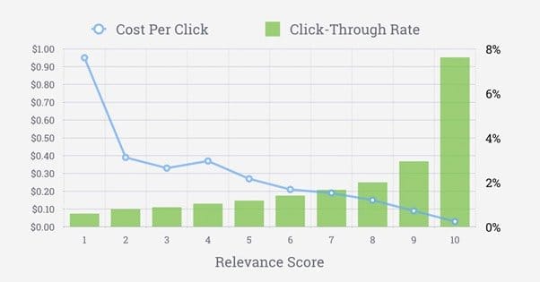
Two things, which if you’re a savvy marketer, you’ve probably already guessed: costs and distribution. When Facebook files your ads into categories, they’re doing something very similar to ranking it with a quality score or relevance score. Ads that are worse are given less preference and less distribution. Ads that are better are given preferential treatment.
Essentially, the more text your ad has, the less distribution it will have. As a consequence, the cost of the ad will rise. You will have to pay more to reach the same number of people you’re perhaps used to reaching.
Now, this isn’t a fine, granular scale. Ads that are OK are OK, even if they’re on the low end of OK. If you tip the scales and end up in Low, you’re going to see less reach and more expense for those ads.
Unlike relevance score, however, ad text ranking does not have an impact on your ads account as a whole. It’s strictly per-ad, and each ad is judged at the time of submission. If you submit an ad and the scanner thinks you have a bit too much text, it will throw a warning, something like “Your ad’s reach may be lower.”
The kicker comes if you enter High territory. Again, Facebook isn’t going to reject your ad, but they will warn you that it will have extremely low priority. You can put money in, but there’s a chance your ad simply won’t be shown, no matter the size of your budget. It’s a soft, silent rejection; the ad still runs but it’s never shown to anyone in your audience, so it might as well not run at all.
