 Written by ContentPowered.com
Think about the last Facebook advertisement you saw. What did you see? I can almost guarantee that the first thing that comes to mind is the image.
Facebook ads rely on images. Large images in the newsfeed, smaller images in the sidebar, whatever. The text that surrounds them is comparatively small and minor. It adds context, but only if you’ve already seen the image and been attracted enough to read the text. Without the image, the text is nothing.
It stands to reason, then, that the primary difference between pro Facebook marketers and novices is the ability to make a good ad image. You need to know who you’re aiming the image at, what kinds of images they like, and how to produce a high quality piece of graphic design if necessary. Thankfully, you have people like me to help you out. Here are my top tips for designing a professional Facebook ad image.
0: Keep Text to a Minimum
I’m starting with zero here because this is a bonus tip! It has to do with your ability to use text in your ad images.
Years ago, the official Facebook policy was that no more than 20% of the ad image could have text on it. This included logos with text, brand names, CTAs, and everything in between. The only thing that didn’t count was background objects that happened to have text on them, like a half-blurred stop sign.
Facebook enforced this rule with a grid tool that was a pain to manipulate. Sometimes the difference between 10% text and 30% text was a few pixels of positioning, but it was enough to get your ads rejected.
Facebook finally changed this policy back in the middle of 2016. These days, they simply grade an image based on text in it. You can get one of four grades; OK, Low, Medium, or High. OK has little or no text at all. Low can have a little bit of text, Medium has a bunch of text, and High has more text than not. The more text your image has, the more restricted your ad will be in terms of reach. You’ll have to pay more to reach the same amount of people if you have more text on your ad images.
Jon Loomer has a great rundown of what this all means here. I recommend giving it a read to make sure you’re not including too much text on your images.
1. Test Multiple Designs
Always be testing. If you don’t have at least three variations for every ad you’re running, you’re wasting your money. I don’t care if you’ve done testing before and found one image works better than another; there are infinite variations on images you can try. Maybe a green instead of a red will catch more eyes. Maybe you need a picture of a gray cat instead of a brown one. Maybe adding a thin border around the image will make it pop more and get more attention. Running test variations means you’re always iterating, always optimizing, always making your images better.
2. Know Your Audience
Generally, you’re going to have a broad and varied audience. You want to subdivide that audience into smaller buyer personas, archetypes of people within your audience. Maybe you have a good segment of your audience made up of middle-aged soccer moms, and another made up of older women, and another made up of old men. I don’t know; it’s your job to make those personas.
Personas are important, because it allows you to target them specifically rather than your audience as a whole. Then you can make images that are more focused on those personas rather than your audience entirely, which means they’ll be more attractive to a higher percentage of the target group. There’s never going to be a “one size fits all” solution to your advertising.
3. Make Sure You Have Image Rights
One thing I’ve seen happen several times before is a business that just goes out to Google and finds an image they want to use, with no regard for the rules and laws surrounding intellectual property. If you use an image that is copyrighted, the original creator can sue you for copyright violation. At the very least, you will have to take down your ad, regardless of performance. At worst, you may be required to go through a court battle that you’ll lose, and pay a settlement or damages.
You can find images through Google with a creative commons search, or through other stock photo sites that have images you can use. Trust me; there are enough good images available that there’s no reason to resort to theft.
4. Bring a Positive Emotion to the Table
If your ad has a picture of a crying baby, I know I’m not interested in seeing more. If your ad has a sad puppy, I might be concerned, but it’s not selling me on anything. A happy puppy, a happy child, a happy customer; positive emotions bring people to the table. We have enough negativity in the world around us, so promising the alleviation of pain and suffering inherent in daily life and business will attract attention.

Of course, you aren’t going to sell based entirely on the emotional, so make sure your surrounding text appeals to the rational side; what the problem is you’re solving, how you’re solving it, and why the customer should turn to YOU to solve it.
5. Be Careful with Stock Images
One of the problems with stock images is that they’re available to everyone. There are whole cycles of memes that rely on stock images. Imagine using an image in your marketing only to find that this all happened the previous year. At best you come out looking behind the times; at worst, you’re painfully unaware of your target audience. There’s also always the chance that one of your competitors chose the same image for their marketing, which can get things confused for your audience.
6. Learn the Psychology of Color
There are a lot of different studies and resources about the use of color that you can dig into if you want.
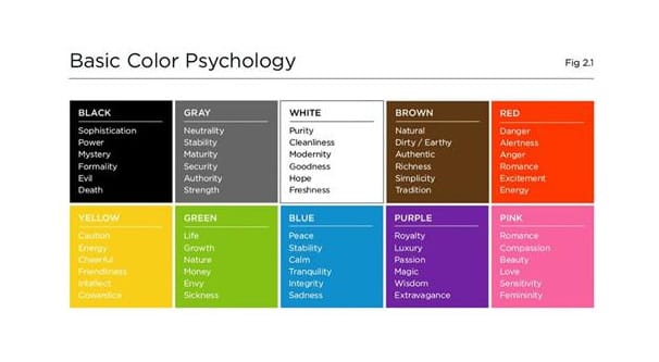
Keep in mind cultural differences if you’re outside the US. Some generalizations:
- Older people tend to like cooler natural colors, like blue, purple, and green. Younger people tend to prefer warmer colors like yellow and red.
- Most people tend to dislike orange, with yellow and brown as other disliked colors.
- Keep in mind potential clashes with your own branding and with Facebook’s branding. Blue is a fine color to use, but blends in with Facebook’s design.
Give it a try when you are split-testing ads; you may be surprised at the results.
7. Use Geographic Imagery that’s Not Overdone
A company advertising in Paris can use images of Paris in their marketing to put people in the right kind of familiarity. When your readers think “hey, I’ve been there!” you have something in common, which is a foot in the door. I generally recommend avoiding the obvious tourist trap landmarks, like the Eiffel Tower, but you can still test them to see if they work for your specific audience and messaging. Obviously, if you’re an agency giving tours of the Eiffel Tower, you can certainly use it in your marketing.
8. Use Images of People
Specifically, use images of faces. Smiling faces, happy faces, concentrating faces; people empathize with other people, in general. Even something as simple as a paid model showing off your product in action – assuming it’s work-safe to do so, of course – can be a great motivator to check out the landing page. Showing people enjoying using your product is a lot more effective at triggering empathy or sympathy than just showing a picture of your product, or some unrelated landscape or pattern.
9. Avoid Over-Complication
It can be tempting to add more and more elements to your image, especially if you’re using graphic design rather than photography as a base. If you have symbols representing benefits of your product, it’s tempting to add every one you can think up, for example.
Generally, though, you want to keep your messaging simple. Figure out which of a small handful of benefits are worth sharing and promoting over the others – the ones your customers like the most – and use those. You can always split-test variations for different ads to see which symbols become most attractive.
10. Don’t Be Afraid of Text
I know the BONUS TIP up above tells you to keep your text to a minimum, but sometimes you need to know you can break the rules. Now, I’m not saying you should make an ad that looks more like a word cloud than an image, but hey; if you blur out a lot of the smaller words and just keep the larger focus words, maybe that would work. It could be worth testing!
You do generally want to keep the amount of text to a minimum, but you can still use some text. As long as it’s not the core focus, as long as you’re not just using a text post screenshot, you can outweigh the slight hit to reach by attracting more people.
11. Don’t Mix Too Many Elements
Keep it simple. If you want a wood grain background, that’s fine. If you want a silhouette of a product, that’s fine. If you want a smiling person, that’s fine. If you want a photograph of a local park, that’s fine. Just don’t try to mix and merge all of them. Remember, you DO have limited space, and adding too many elements just makes your ad image look cluttered and messy. People will feel initially stressed just trying to parse what’s on the image, which turns many away immediately and gives the rest an unfavorable impression.
12. Use High Resolution Source Images
If you’re using photography rather than, say, vector graphics, you want to make sure your source images are high resolution and are saved in a lossless format. Not JPGs for you, my friend. The problem with lossy compression is that you lose data and clarity with every save.
![]()
That means your images can end up looking pixilated or fuzzy in a way that just looks bad.
13. Experiment with Bonkers Ideas
Maybe tomorrow you wake up and you think “hey, I bet a dinosaur mascot could be interesting.” Try it out! Commission a graphic artist to make you a little cartoon dinosaur to use in your marketing, run a few ads, and see if they work. At worst, you waste a hundred bucks or so. At best, you find a new marketing angle that brings in a whole new selection of audience members. Just don’t be afraid to shake things up from time to time.
14. Maintain Brand Consistency
If someone has expressed enough trust in you to click on your ad, it’s imperative that you do nothing to disappoint them. Some people will simply be too hard to please, but at the very least, you can make sure that what they see on the other side is what they expect to see. Don’t do a bait and switch with your marketing. If you promise a product for $10, deliver a product for $10. If you promise a product relating to dogs, showcase a product relating to dogs.
This isn’t just a good idea to keep customers interested; it’s essential as part of Facebook’s quality control. If there’s a disconnect between your ad copy and image and your landing page, Facebook might reject your ads.
15. Use Subtle Optimizations
Here’s a fun trick; if you have a person and text on your image, make the person looking at the text. You don’t need to make it explicit; they could be looking at their phone, but the text is below the phone. Since the reader can’t see what’s on the phone, their gaze follows line of sight to the text. This, and other subtle elements of guidance, can improve flow through your image and to your ad copy surrounding it.

