 Written by ContentPowered.com

It’s tough to answer a question like the one posed in the title here. What are the best converting ad images? I can’t tell you. The answer depends on a lot of factors, ranging from where the image is positioned to the continuity between your ad and your website. I’ll try to give you some specific advice, but first, let’s go over what makes a good ad image.
The Core Features of a Good Ad Image
I’ve broken this section up into three sub-sections. The first is general tips for your images, as accumulated by long practice and a lot of learning from the pros. That’s these:
The image is aimed at a specific buyer persona. Your audience is made up of a lot of different types of people. The images that resonate with young females won’t work for older males, and the images that work for either of them won’t work for other sub-demographics. Give some thought to the kinds of people you’re targeting, and what they specifically want to get out of you.
The image has a minimal amount of text. Facebook may have done away with the hard-and-fast 20% text rule, but they replaced it with something else. Something that may or may not be worse. Now, the more text you have – as judged by their scanners and human review – the less exposure your ad will get. You can read all about the new rule and what it means for your images over at Jon Loomer’s fantastic review.
The image is bright and vibrant. Color plays a big part in ad conversions. At the very least, you want bright and vibrant colors to stand out against the sea of blue, white, gray, and black that makes up Facebook. If you want to really get into the nitty gritty of it, you can dig into color psychology. Frankly, I don’t pay a ton of attention to this, because it ends up being diminishing returns compared to other optimizations I could make, but maybe it’s something you can put to good use.
The image is the right size and shape for its destination. Remember that ads can run in different places, and different ads have different ideal sizes. Facebook publishes guidelines for these here and there, but you can reference our list of Facebook image sizes here instead.
The image is high resolution with no artifacting. Artifacts are places where the compression of an image file removes fine detail and adds fuzziness. It makes your images look low quality. It’s primarily an issue with highly compressed jpg files, and can usually be solved by using a high quality source to make a smaller lossless file. You can read up on artifacts here.
The image includes a positive value proposition. People want to know what they’re getting out of your ad, and the easiest way to convey that information is through an image. For example, if you’re selling a box of food delivered to the customer’s door every week, showcasing a vibrant picture of a few food items can go a long way towards making your offer look enticing. Show off the value the user gets, and don’t rely on text to convey it if at all possible.
The image is tested against other images. Split testing should always be a part of your advertising plan. Anything from a tiny variation in border color to a complete shift in tone can have an entirely different effect on your audience. Test variations, see which performs best, and iterate.
The image changes from time to time. There’s a concept called banner blindness, where users start to ignore ads when they see them in the same places all the time. A similar problem happens when they see the same ad too many times, regardless of position. Many people will start to negatively associate your brand and ad with spamming. Changing up your ads dilutes that association and makes them pay more attention to the ads themselves, and less to how often they’ve seen your ads.
The second sub-section of this section are a handful of optional subjects for your images. You don’t have to try to hit all of them, or even any of them. These are just things that Wishpond recommends.
The image may include happy people. Happy people convey positive emotions, and imply that the people pictured are satisfied customers. While we all know they’re probably stock models, the subconscious association is still there and can benefit you.
The image may include a simple logo. The images should be varied throughout your marketing, but they should always include a small, recognizable logo. The thinking here is that over time people will recognize your logo, and that familiarity will help them convert. They don’t necessarily know where they’ve heard of you before, but so long as it’s not overtly negative, it’s assumed to be a positive recommendation.
The image may include children or pets. Both of these are adorable and tug at the heartstrings of certain groups of people within your audience. Any time the image makes a sensitive person say “awwwwww” it’s a good image… for targeting that kind of person. As usual, you need to keep your target demographics in mind.
The third and final sub-section is just these two entries, but they’re essential. You can’t pass these up, for obvious reasons.
The image matches the message of your ad, and the destination website. This is what the Facebook quality score is all about. People see your ad offering one thing, and they decide to click it because they want that one thing, your landing page had better be offering that one thing. If you’re offering something else, or if you’re putting a bunch of roadblocks in the way, people will get upset with you and will be more likely to back out instead of converting like you want.
The image meets the requirements laid out in Facebook’s guidelines. This one is obvious enough. You can’t get an ad approved if it violates one of Facebook’s guidelines. There are a lot of them, too, so make sure you read up before you start picking images.
So, to tie everything together, you really need to understand two things. What is your brand offering, and who are you offering it to? This will guide the kind of image you choose.
Examples of Good Ad Images
There are a lot of possible examples of high converting ad images, so I’m going to give you a handful of them.
Google’s Cloud Platform
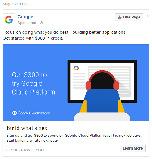
This ad is simple and vibrant in color, though I do have a few gripes with it. First, the good. They know specifically who their demographics are, and even without being in that target audience, I can see it. They’re reaching out to app developers and trying to attract them to their cloud platform. The value proposition is clear; you get $300 in credit for the platform by signing up.
So what do I not like about it? It’s primarily blue, which means it’s going to blend in with Facebook to an extent. I also can’t tell if the figure is supposed to be hunched over a screen or if they have an odd blue-backed chair, and neither looks comfortable.
Dollar Shave Club
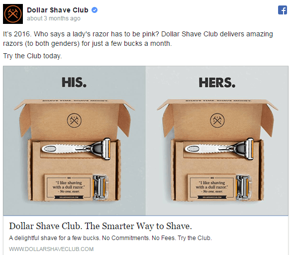
This ad stands out because of how well they know their audience, and how they’re trying to expand it. DSC is all about men’s grooming. That’s how they got their start. They quickly realized that cheap razors were a good value for both men and women, particularly since women face marked up products all the time. This ad plays on that, by showing that their packages are available for both men and women, and there’s no difference in the contents or the packaging. No unnecessary genderification of the products, no markup, no difference.
The kinds of young women most likely to be the target audience of this ad will appreciate it. My one gripe with the ad is the comparative lack of color. I might have changed the background to something other than gray, but then, DSC’s branding has always been a sort of stark, industrial feeling, so the gray fits.
Shopify
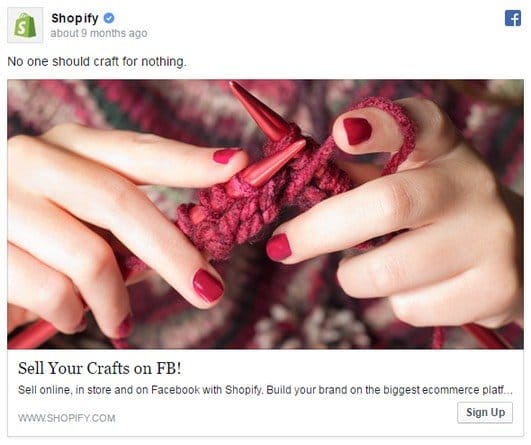
Shopify is notorious for having hundreds of different ads in circulation at all times, running split tests and targeting small segments of their audience. This is with good reason, too; their audience ranges from stay at home mom’s with crafting hobbies to mid-sized businesses outsourcing their shopping system.
This particular ad is aimed at the former, showcasing the hobby in question with a bit of knitting, which was once the domain of old women but is now fashionable among millennials. I particularly like how it’s primarily warm colors with an emphasis on a rich, deep red that will stand out very well against the typical Facebook colors.
Visa and Pizza Hut
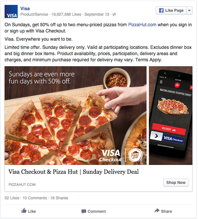
This is an odd add. It’s a great ad showcasing delicious pizza with the staple seasonings and rustic table settings of a Pizza Hut, along with their logo. However, the ad isn’t for Pizza Hut specifically, it’s for Visa, encouraging you to pay using their cards at your local Pizza Hut. It’s a cross-brand offer, and it shows a value proposition right away.
On the other hand, the sidebar with the phone looks a little shoehorned in. Yes, it’s meant to showcase using Visa’s mobile integration for payment, but it makes me feel like it should be a carousel ad with how the image is pushed to the side and cut off. That, and the text on the phone could trip flags, so they might just be better off using the one main image sized properly.
Target’s Anything
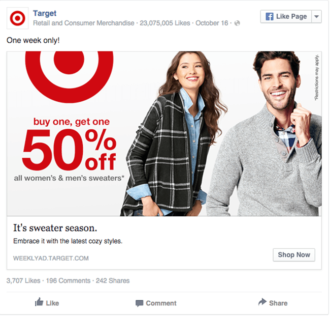
This specific ad is advertising sweaters, but Target tends to have a wide variety of ads all using similar models with similar layouts.
The logo is clear, the red stands out, and the people are modeling the items in question, presumably. It fits the bill for smiling people, and covers both genders for a wider targeted ad. The value is right there too; buy one get one half off. There’s not much to it and not much to say about it.
We’ve covered more over in another article specifically written about examples of high converting ads. It’s not necessarily focused entirely on images, but you can get a good idea of what works by browsing through them here.
So where does this all leave you? Ideally, with some ideas. Here’s the thing; there are so many possible images and so many possible angles to take with your marketing that it’s impossible to recommend anything specifically as the “best” for your brand. You need to be aware of your branding and the kind of company culture you portray. You also need to know who you’re reaching. So, to pick the ideal image, do this.
- Figure out the specific buyer persona you’re reaching.
- Figure out what part of your company culture and branding appeals most to them.
- Figure out what kind of offer you’re going to deliver with your ad.
- Find an image that reflects this offer, or create it yourself. Make sure the image meets the guidelines up above, in terms of quality, color, size, and all the rest.
- Create and run the ad.
- Repeat #4 and #5 with a variety of different images, to test variations using the same ad copy and same targeting.
Through this process, you can measure conversion rates and volumes to figure out what specifically works for you and what doesn’t. Only then will you find the perfect images for your brand.
Of course, then you remember that all ads should rotate over the course of a few weeks or months, when ad frequency approaches 1. That’s the only way to keep your advertising fresh and your users interested. The more they see the same old images, the less likely they are to give you the time of day.
