 Written by ContentPowered.com

On the scale of visual media, at the top end of expense, you have television commercials. If you cut down the expense, audience and exposure in favor of length, you end up with YouTube. Cut down length even more and you arrive at Vines. Drop the length and the sound, and you reach animated gifs. Twitter recently debuted support for animated gifs, and companies instantly recognized the potential. Here are some examples of how companies are using Twitter’s gifs.
1. A Simple Promotion Response from Forever21
This simple gif from Forever21 plays off cultural ideas of how people react to a good deal; enthusiasm and joy. It’s a simple, short loop that actually loops without jarring too badly, which is rare enough as it is for animated gifs. If you notice, they used a bitly link for their promotion info as well; a custom link that acts as a branded tracking device as well as a shortened URL. The only thing they could have done to improve it is use a higher quality source for the gif.
2. A Product Highly from Marshalls
Another simple gif, this time with no frills and nothing fancy. Have a new product to show off? A gif spotlight of a handful of pictures stitched together works perfectly well. Marshalls plays off feelings of summer parties with the sun emoticon in their tweet, as well as using one of their hashtags to brand the tweet. How could Marshalls improve this one? The fade to bright at the end of the gif is fairly jarring. They could have extended the gif for a more complete rotation view, rather than cut a few frames from a commercial.
3. A Brand Display from St. Ives
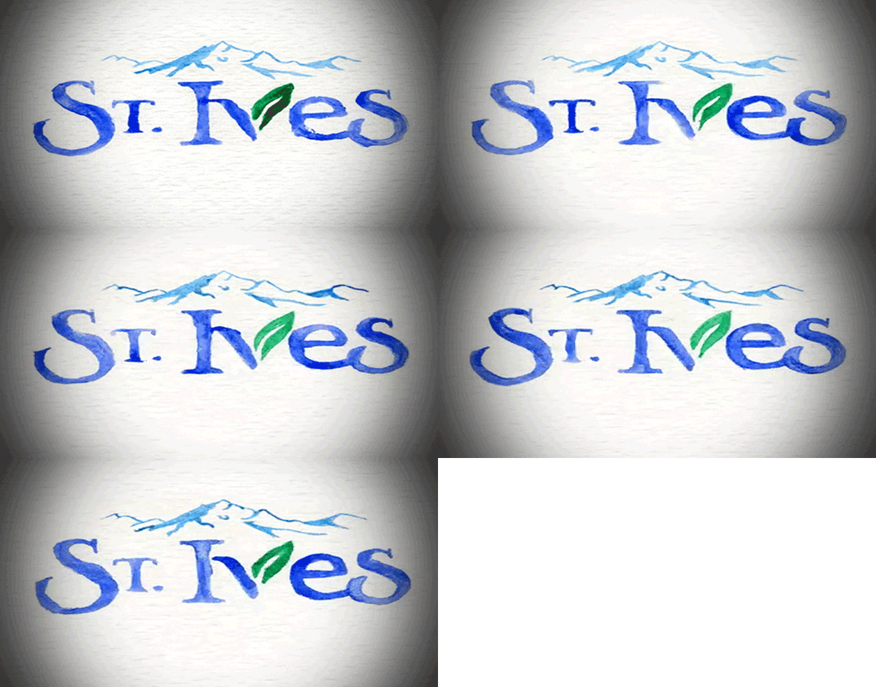
St. Ives uses this simple tweet to foreshadow future use of gifs on their platform. Their contribution is simple and basic; an animated watercolor of their logo. It’s not particularly detailed, but it has a very nice handcrafted look that goes well with their brand and the impression they want to convey. To improve this tweet, they may have wanted to make a little more sense in the actual text content, or at least add a gif response hashtag.
4. A Narrative Trailer from Divergent
One of the bigger book-to-movie adaptations this year, Divergent is riding on the young adult success of previous books such as the Hunger Games trilogy. As a big budget action film, Divergent was able to cut together a pared-down version of one of their teaser trailers for this gif. It’s smooth, it’s decently long, it tells a story and it’s not jarring in its repetition. The tweet is well composed, with a hashtag and a call to action as well.
5. A Bit of Humor from the National Aquarium
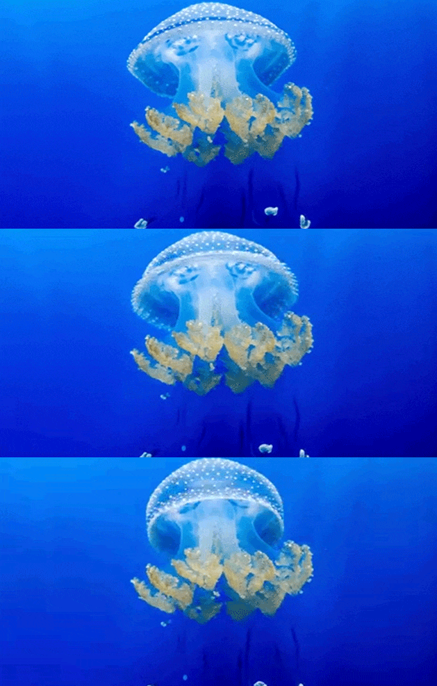
This gif fills two roles at once. First, it’s obviously a creature the aquarium has in their tanks, ready to be seen in person when you visit their location. In that sense, it’s a valuable advertisement in its own right. Second, it goes along with the play on words – Jelly and Jealous – in the tweet itself. The only way it might improve is the same way all too many Twitter gifs need to improve; a higher framerate for smoother animation.
6. A Simple Question from Tropicana
Tropicana does several things well with this tweet. First, the tweet is short and leaves plenty of room for users to respond. Second, the tweet outright encourages users to answer the question, by asking for a retweet and providing team-based hashtags to pick. The gif is icing on the cake; showing the competition in a lighthearted manner without alienating one side or the other or showing their own preference. The cartoon nature of the gif would lend itself well to a follow-up if one team receives more votes; a winner in the contest they display.
7. A Slice of History from TVLand
TVLand is one of a few brands that has a very ready appeal to nostalgia. Other brands that can appeal to that type of nostalgia are those who have target audiences specifically in a certain age range. Millennials are great targets because of the proliferation of great material in the late 80s and 90s to pick through. This gif ties in with both the nostalgia and the core audience of the network. Not much to improve upon here, except perhaps a hashtag.
8. A Bit of Education from NASA
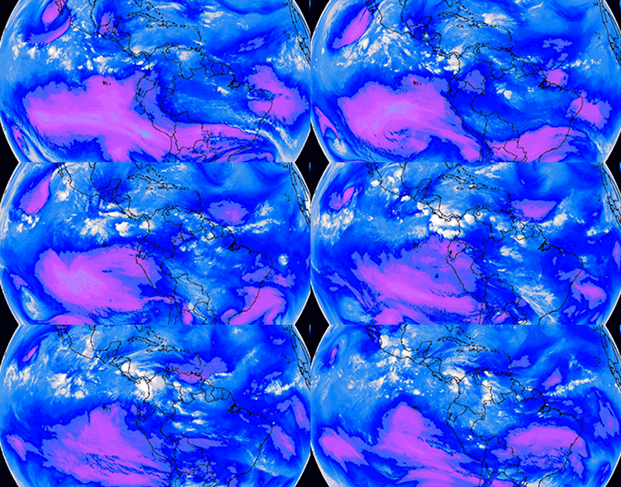
NASA has lost so much funding that they have been forced to become something of a PR machine more than a scientific institution. They have successfully leveraged this by taking steps to make science more accessible and, more importantly, beautiful. Their picture of the day site is one example, and this gif is another. Leveraging a bit of education with a bit of beauty, coupled with hashtags and an explanation in the tweet, leaves this well deserving of its nearly 500 favorites.
9. A Dose of Insanity from Denny’s
Denny’s Diner is a deep well of Internet-brand insanity in their web presence. As a restaurant, they’re something of an unremarkable breakfast diner. As a social presence, they are utterly unique. They have long since divorced themselves from any concept of restraint or going with the flow, and this gif is one example of what they produce. Combine this and their ability to cater to late-night munchie runs and you begin to understand their target demographic, and the brilliance of their campaign.
10. A Playful Side from Subway
Subway here produced a short looping gif of a game, which has little to do with their brand. The inclusion of cookies rather than the typical X and O is their touch on the gif. What this gif does well is encourage comments; the flow of the game makes anyone who cares about tic-tac-toe writhe with recognition of the play mistakes. Unfortunately, the lack of hashtag or much brand relevance leaves the rest of this tweet falling flat.
11. A New Way of Seeing the World from Jeep

This particular gif from Jeep is a great showcase of their brand and their product all in one. The camera on the ground, an uneven surface, shows the action of an off-road jeep passing by. The color contrast and the high framerate make for a compelling gif, and the hashtags help circulate the tweet itself. Jeep’s one flaw is the lack of a branded hashtag to rally brand fanatics.
12. A Glimpse at Current Events from Google
Leave it to Google to produce an extremely high quality gif that ties in to a current event without sacrificing anything. The gif is branded with the Google colored letters. It’s bright and colorful, attractive to the eye. It’s immediately recognizable in subject – the World Cup – and it came in the midst of the festivities. It’s relatable and it’s smart.
13. A Product Demonstration from Samsung
Samsung uses this gif to showcase a feature on their new phone, a feature that’s very useful to a large number of users. Further, the brand ties it into the Twitter gif craze by explaining how to use it to post just one more gif before your battery truly dies. The branded hashtag could have been used better – “You just HAVE to send one more GIF on Twitter before your #GalazyS5 dies?” – but including it was enough.
14. A Dazzling Image from The Society
This gif just puts the power of imagery to use in a flashy, spectacular way. It’s an interesting idea, but brands need to be very careful with this kind of image. There’s a reason epilepsy warnings exist, after all. A slightly slower framerate for this one may have been called for.
15. Your Next Gif
What inspiration have you taken from these interesting, compelling and occasionally beautiful gifs? Tweet a great gif and let us know how it went.