 Written by ContentPowered.com
Twitter is far from a perfect platform. There seems to be a pretty big disconnect between what the higher-ups at Twitter think should be happening on the site and what the actual users of the site experience. Bots are rampant, scams are everywhere, Nazis are a continuing problem, and none of it seems to be addressed.
Twitter announced that they’re releasing a prototype app, called Twttr, to test potential new features for the main app and website versions of the platform. That app exists now, in limited availability, and people sure are talking about it. The question is, is it any better than the Twitter we know, or is it just another misinformed and misguided experiment meant to appease the masses with needless features?
What Is Twttr?
Twttr is three things. Twttr is a testing app for new features that do not exist on Twitter. Twttr is a prototype in limited availability. And Twttr is a potential glimpse into the future of Twitter itself.

Twttr was actually first released back in January of 2019, though it was extremely limited in a testing phase. Only a few early bird alpha users, and those limited to iPhone devices, were able to access it. This limited audience was only able to talk amongst themselves, to experience the new platform and to give feedback on it – everything from bug reports to broad feelings. Twitter would then harvest this data, analyze it, and – if what we know of Twitter in the past stays true – completely disregard it to do what they want instead.
Okay, so I’m poking a little fun at them, but it’s not exactly untrue. Twitter has a history of ignoring features users like in order to focus on features they don’t care about. Just think about how many people hate the “curated stream” and just want their chronological feeds, and how hard Twitter has been fighting to push curation.
So what has Twttr been adding to test, and how much it impact the main Twitter app?
What Twttr Brings to the Table
First of all, the people enrolled in the Twttr beta are not under NDA. This means they are free to talk about and discuss the new features in as much detail as they wish. Twitter isn’t trying to hide anything they’re doing with this prototype app, unlike what they do with their Experiments Program and other fringe tests.
It’s also a much earlier glimpse at features than what Twitter has tested before. They claim that user feedback will have a huge impact on what Twitter actually rolls over to the main platform, though I am personally quite cynical about their ability to rein in bad decisions.
The current Twttr app is still only accessible to limited users, by the way, but it browses Twitter as a whole, and not just a limited community. You’re using Twitter, just using it through a different app.
So what features and/or bad decisions is Twitter testing in this new app? This article can give you a rundown of some of the most recent features, but I’ll cover as much as I know. I’m not currently in the beta, so take all of this with a grain of salt. Any of you who ARE in the beta and want to correct me, leave a comment, please.
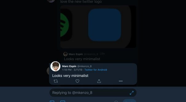
Color-coded replies. One of the main things Twitter is testing out is a color-coded reply system. The varied colors will make it much clearer who the original poster of a tweet is, and then will show a difference between replies from people you follow versus people you don’t. It also highlights replies from the original poster in the thread, to better follow conversations.
You may have seen this photo circulated over the last month or so whenever anyone talks about Twttr. This is a showcase of what those colors currently look like, at least in testing. Twitter claims those are bold, vibrant colors used explicitly for testing; the removal of Night Mode and the huge contrast is simply to minimize differences in data sets. They’ll tone down the colors for the main release, assuming user feedback isn’t terrible and they don’t go back on the decision entirely.
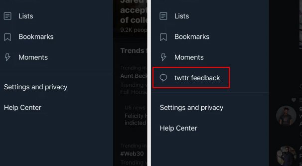
In fact, this is one area where the claims were true. The version of Twttr that was released a few days ago includes much more muted colors and the usual Twitter Night Mode colors.
Threaded replies. Colors were the first test, and since those seem to have worked out with some caveats, Twitter has tried another experiment: threaded replies. Since conversations on Twitter are already threaded, this is more of a display change, to show the chain of replies so you aren’t misinterpreting different parts of different fringe conversations.
The whole thing ends up looking a lot more like Reddit, with some odd little curves to the reply structure to at indicate the end of threads or that there are deeper, more nested replies you can expand to see. The Verge wrote about this with a few screenshots here.
Algorithmically sorted responses. According to Twitter, data shows that a lot of power users use various features, like the hearts system or multiple tabs, to figure out different chains in threads of responses to read and follow up on. Reading linearly on Twitter today can be pretty confusing, and you might not always want to use a Like to indicate something you want to read since you might not actually like it.
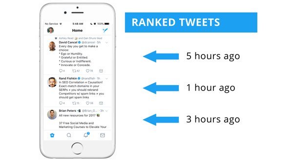
Twitter’s experiment here has been to apply their curated feed algorithm not just to tweets in the main timeline, but to replies within tweets. If it works, users would see the best sorted replies up top according to their interests, and can ignore what comes below.
Of course, knowing Twitter’s track record with hiding relevant posts and promoting absolute garbage, not to mention filtering out posts with even the most minor of curse words in them, this seems destined for disaster. How it works – and if users can disable it – will remain to be seen.
Hidden engagement. If you’ve ever pushed for more likes on your tweets – or if you’ve ever seen someone get ratio’d – you know how important the like, reply, and retweet metrics can be to see how popular content is.
Twitter’s experiment with threaded replies has hidden engagement unless you tap to expand a specific post. Think of it like Facebook Messenger, where chats are simple call and response, but if you tap a specific response, you can add a reaction to it. It’s similar to that, though of course it maintains all of the like, retweet, and reply features of Twitter at its core.
The idea is simple enough: if you care about your metrics, you can tap to see them. If you don’t care, you can just continue reading through replies. Now, how this interacts with threaded replies remains to be seen. You may have to end up tapping every reply just to see if it’s a loner or if it has a hundred responses.
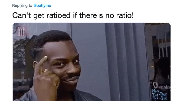
Besides, you can’t get ratio’d if you can’t see a ratio!
Status updates. One concept that I’m not sure Twttr is testing or if they’re simply considering is a “status message” for your account. Remember AOL Instant Messenger, and how you could set your Away Message? This is basically that concept making a glorious return. Since a lot of people use Twitter to talk in an IM-style fashion about current events, it seems like a minor step to making the jump into a chat platform.
This one seems to me to be indicative of Twitter’s complete lack of any idea of what they’re doing. A pivot into instant messaging would be insane; the field is already dying, with old messengers like AIM or YIM shutting their doors, newcomers like Slack and Discord taking up the remaining space, and even those having to find defined niches – Business for Slack and Gaming for Discord – to thrive. Twitter trying to expand into that space is, frankly, quite stupid.
Changing focus. One more vague assertion from Jack at CES was that Twitter needs a new onboarding process and a new experience, a way to push discover of new content and interaction with new people rather than the “echo chamber” of solely your own content and that of people you follow.
This, again, seems to me to be a stupid idea. Twitter’s curated feed, plus the fact that you often see highlighted replies and tweets from people you don’t follow, not to mention all the sponsored posts, means there’s a ton of content you see every day that you really don’t want to see. For a lot of people this is simply noise in the feed they have to ignore to get to the good stuff. For some people, this is often showing them tweets from their harassers or abusers, or hitting triggers, or otherwise dangerous content.
Which App is Better?
The question of the day is which app is better, but it’s not really a valid question. If you want to get Twttr, you need to get into the beta program, and that’s limited availability. This isn’t an alternative app you can use, it’s a testing ground for new features. Some of those features will be heavily tweaked and tested again. Some of those features will make it to the main app and website versions of Twitter. You can’t really pick and choose which experience you want to have, at least not really.
As far as the features are concerned, well, with change comes outcry. Some people are going to hate the new features. Some people are going to not care about them. Some will leave the site entirely, while others will adapt.
This change won’t kill any businesses using the site, not by a long shot. It may make certain kinds of influencer marketing a little harder, since your tweets will be pushed lower on the feed if the person you’re tweeting to doesn’t follow you. It gives me the impression that they’re going to end up focusing too heavily on verified users and their checkmark-laden audiences, rather than regular users interacting in a world where a passing brand can change their lives.
Whether or not the changes shoot themselves in the feet will really rely on how their algorithmic sorts are pushed on users. I’m one of those people who prefers the chronological feed, so I’m not looking forward to the change. Other folks may be more willing to give it a shot.
Also, none of the changes deal with more of the major problems Twitter faces, like bots and Nazis. Bots may suffer a bit with an algorithmic sorted feed, but the white supremacist echo chamber is simply going to benefit from many of their members being algorithmically sorted into the feeds of impressionable young people.
Getting Twttr
If you’re interested in experiencing this new app yourself, you need to apply to the beta program. To do that, you need to take this survey from Twitter directly. They want to know your username, your primary device, your language, and your country. Submit it and wait. They’ll email you using the email you have attached to your account within a few weeks, and if you’re lucky, they will include instructions on how to install the new app.
As of right now, the Twttr app is only available on iOS, so you’re restricted to just that one platform if you want to give it a whirl. Sorry Android and desktop users, you’re out of luck.

