 Written by ContentPowered.com
A while back – two years ago at this point – we wrote a post about using video for your cover image on Facebook. You can check out that original post here. Since then, I haven’t really seen too much of an uptick in video cover usage, and I’m left wondering why.
Does it not work? Well, the examples we linked in that older post are still live, so the feature still exists. Checking on a Facebook page now, and “upload photo/video” is still an option, so obviously the feature still exists. It’s not limited to larger pages or anything either, because it’s available on a page I use for testing that has never been published and has zero fans.
Does it not work for marketing? I could see this being a bit of an issue, but not much of one. I mean, the majority of your interaction on Facebook doesn’t center around your page, it centers around user feeds and posts, so a lot of your followers might never know you have a video cover. Those that DO notice, though, will be able to watch the video just fine.
No, what it seems to come down to is mostly just that Facebook has different requirements for video in a cover photo. Videos have to be at least 820×312 and Facebook recommends the standard 820×462 resolution. This is almost exactly 16:9, but the problem is, Facebook often cuts off some of the top and bottom of the video. This means when you create a video, you can’t put valuable information in the stripes across the top and bottom.
In any case, producing a video to use as a cover isn’t as difficult as it may seem. Anyone holding off because they’re unsure of themselves or aren’t sure how to make one can read ahead to learn.
Learn the Requirements
The first thing you want to do when you’re starting to consider a video for your cover slot is learn what you can use for that video. Facebook recommends 820×462 resolution, but you can scale that up as long as your video is still 16:9. Anything smaller than 820×312 won’t work.
Additionally, your video needs to be between 20 seconds and 90 seconds long. Most videos we tend to create for Facebook are longer, or they’re meant to be short Vine-like clips, so they tend to fall outside of this range.
Should you choose a longer video or a shorter video? Well, bearing in mind that most users are going to have a short attention span when they’re browsing your page, I personally figure that a shorter video is better. That’s really up to you, though, so feel free to test it yourself.
One thing to mention here is that, much like a cover photo, when you upload a video to use – or choose a previously uploaded video to use – it becomes a video post. Users can click through the video to reach the video post, and that post will have all of the usual trappings of a video on Facebook. It has an expanded video page with a view count, comments, reactions, a play bar, shares, and all of the rest.
Since Facebook loves video, you can use this to your advantage. Write a description that showcases your video as a cover video and entice people to check it out in its natural habitat, on your page.
Evergreen or Temporary?
A second question you need to answer is this: do you want your cover video to be a temporary, timely advertisement for something you’re showcasing, or do you want it to be more of an evergreen video you can set and forget?
- This roofing company we used as an example last time uses theirs as an evergreen sales pitch for the kinds of work they do; residential and commercial, all roofing, all quality.
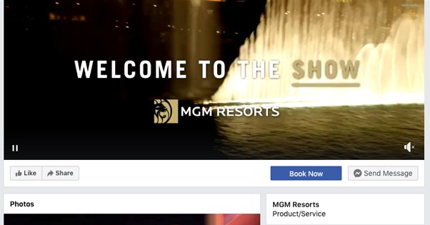
- MGM Resorts has a simple video of a water feature and a tagline, something that shows off the kinds of entertainment they can put together in an incidental water feature, and a relatively timeless video.
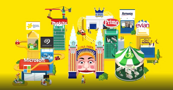
- Hello Social has a cartoony, animated cityscape they use as part of their branding, to showcase that they’re used by various brands and that they work with integrating an ecosystem.
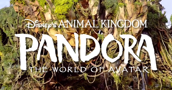
- This movie plays a teaser trailer showcasing a battle scene, with a bit of text indicating that the movie is out and available to buy.
- Easil is a DIY design engine similar to something like Canva, and they use a video to show their design process in action, with a bunch of text explaining what they do.
You’ll note that pretty much every example I can find is an evergreen video. I have no doubt that more temporary videos exist, or have existed, but if I link them to you, it’s just as likely to be gone by the time you read this in the future.
That’s not to say that you can’t use a temporary video for a cover video. Using one as a sort of mobile billboard, teaser for a product launch, or other form of advertising is perfectly acceptable, even valuable. It’s just more difficult to link to as an example, is all.
Ignore Sound
One thing you may have noticed is that the videos used as cover videos lack a certain something. Notably, they’re missing video controls. You can pause and play them, and you can un-mute them if they have sound, but they start muted. Note: I may have mentioned in the past that these videos start paused. This was my mistake; I use a plugin to disable a lot of autoplay, and it disabled those as well. Cover videos play automatically, muted, making them generally quite attractive.
Still, these videos have no sound by default, so when you’re creating a video for your cover, you want to make sure you don’t need sound to understand it. No “person talking to the camera” formats, for example. You don’t want to rely on sound and then have someone watch it muted, and opening a video with sound mid-way through means the user has to wait for it to loop to hear the beginning, since they can’t skip to a specific section of the video.
Use Static Text
Since you never know at what point the user is going to look up and see the video, you don’t know when they will start watching. This is why simple loops work better than longer explainers.
If you want to use text in your video – and you don’t have to – make it as static as possible. The MGM and movie examples up above both do this; they have static text on the video with a background that animates.
Oh, feel free to experiment with a sequential animation with text explaining something if you like. Maybe it’ll work fine for your brand. Personally, though, I’d recommend using a slideshow users can control rather than a video they can’t for that purpose.
Decide on a Purpose
What do you want your Facebook cover video to accomplish for you?
I’ve looked through a number of examples and come up with a few different archetypes I see most often.
- Product announcements or showcases. This one is pretty common: just show what you offer or what you do. That roofing company shows both residential and commercial roofs, Easil shows their design work, and so on. For a “new product” version, Disney used a video temporarily to promote their Avatar world.
- Service explainers. Easil is a good example of this. They offer a service and they explain what that service is. They made a static design with text to explain it while other parts are animated.
- Resume or portfolios. I’ve seen people who make videos or produce photography, for example, create simple videos showcasing their work quality as a sort of immediately visible resume when a user visits.
- Aesthetics. A company like Hello Social uses their photo to showcase some element of aesthetics or branding. I’ve seen other pages that just have simple, abstract animation to showcase the user’s personal aesthetic as well.
- Enticement to visit. This Chicago hotel produced an aesthetically pleasing video of their bar to entice people to visit. Other locations I’ve seen have videos of walking into their building, or views from their hotel rooms, or what-have-you, to entice people to come visit.
- Cinemagraph or logo. Sometimes simple is all you need. An animated version of your logo or a simple animated cinemagraph can showcase your brand without being overly complex.
Once you have an idea of the video you want to produce, well, you need to produce it. You can go about that in a few different ways, using various tools.
Producing Your Video
The way I see it, there are three ways to make a video you can use as a cover video.
The first way is to pay someone else to do it. There are plenty of freelancers out there who are willing to work for some money, and can take an idea and assets you provide them and turn it into a video. Here’s a Fiverr search with people willing to make a Facebook cover video for as low as $20. Likewise, here’s an Upwork search with people willing to work for anywhere from $15 an hour to $100 an hour doing video production for you.
The second way to make a cover video is to do the legwork yourself. You’ll need either video production equipment, like a camera with a decent resolution, or some kind of animation studio capable of making the design assets you want to use. You’ll also need some software to edit your video. Adobe Premiere, Lightworks, and Final Cut Pro are all good examples I’ve known people to use.
Note that this method is typically going to be the most resource-intensive and may be the most expensive option, simply because investing in a top-shelf piece of software and the equipment necessary to produce video can be expensive.
The third and final way is to use a simple template-based editor. I’ve talked about Canva a lot on this site, because it’s a template-based graphic design engine that produced static images for your social media pages, blog, or whatever else. What if there was something like a Canva, but for video? Template and asset-based editing through a web app sounds ideal. Thankfully, such apps do exist.
Maker Moon is an online template-based video editor that provides templates, some for free and some for money. They watermark free videos, which is unfortunate, but the paid version is only $70 per year so it’s really not that bad to buy.
Adobe Spark is part of the Adobe creative suite of apps, and it allows you to produce images and videos similar to how Canva works, but with an Adobe-flavored twist to how the whole thing operates. Spark Video operates as a web app and as an iOS app, though there’s no Android version at the moment.
Wave has been described as Canva for Video, so it’s exactly what we’re looking for here. It’s a free online video maker that has a paid plan for some additional features, like MP4 exports, white-label previews, and so on. Different paid plans range from $9 to $50 per month.
Using one of these tools will make video production easy, though you may not find something that perfectly matches your concept. Still, it’s worth giving a look, don’t you think?
