 Written by ContentPowered.com
On this site, we have frequently mentioned Canva and how it’s a great site to use for setting up social media images. However, many users feel more comfortable with their own tools, most notably Photoshop. Rather than tell you to switch, I’ve decided to put together a list of templates and resources you can use in Photoshop – and any other image editing program that can open PSD files – to make Facebook ads.
A Note About 20% Text
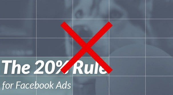
One common item you’ll see in the links below is a mention of the Facebook 20% text rule. This was a rule Facebook enforced using a grid tool, to make sure you didn’t put too much text into your images. It applied to news feed ads and mobile ads, but not sidebar ads.
I’m using the past tense here because recently Facebook made a change that removed the grid tool and the rule behind it. Instead, they replaced it with a scaling text-based reduction in exposure and increase in costs. Rather than simply having your ad rejected if it filled too many boxes on the grid tool, they simply analyze how much text is on your image and change your exposure accordingly.
The more text you have on your image, the less it will be shown to people. The primary consequence of this is rising costs, as you have to pay more to have your ad shown to the same number of people you would get if you had less text.
You can read a more in-depth look at the new system here.
So, now you know why so many of the links below will talk about having grids included in their templates, or having text templates arranged to minimize the amount of text on the image. It’s all to conform with a rule that no longer exists in that form. However, it’s still worthwhile to aim for low text, to get the most exposure and the lowest costs you can get out of your ads. Nothing else has changed, so image dimensions and layouts are all still viable.
The Resource List
AD Parlor’s Facebook Photoshop Templates – This page is from the help center of Ad Parlor, and it contains several different files for different styles of ads on Facebook. It covers photo ads, link post ads, multi-product ads, offer pages, page like ads, mobile ads, and more. All of the files are simple PSDs you can load up, but they don’t have much going on with them. They’re mostly just there to be a size constraint, to show you how big the image should be when you submit your ad. It’s a good way to get some simple referential images, but it’s not a detailed set of layouts.
Of secondary interest is the Ad Parlor Ad Mockup tool. It’s like a lite version of Canva, and they don’t provide any of the resources for you, just some templates. You can use it to see what an ad would look like in various locations with your message, your image, and your call to action. It works for Facebook website clicks, mobile and desktop app installs, video posts, statuses, photos, offers, events, and page like ads. It also works for a selection of Instagram, Twitter, and Pinterest ads. You will, however, need to disable any ad blockers you’re using to be able to access the tool, and it works best in Chrome.
Behance’s Carousel Ad Template – This Photoshop template file is a much more layered and nuanced mock-up of how a carousel ad will actually look and function. They took one wide image and divided it up to show how continuity can work between images, in a style you can replicate. They also make use of layers to make individual elements of the ad images changeable.
Each image is relatively simple on it’s own, though; little more than just a background image and a line of text. If you want to expand upon the layout, you will need to do it yourself. This download is served by Dropbox, so you may need an account or you may encounter bandwidth limitations; if so, try again later.
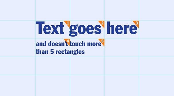
Blueprint Interactive’s 20% Text Guide – This is one of the outdated template files I mentioned at the top, but I’m including it because it’s still useful as an estimator to see how much text you might be including. You don’t need to pay attention to the specific grid layout any more, but it’s still useful to see what sort of percentage you’re looking at. You may have more text than you realize you have, if you’re not used to this sort of thing.
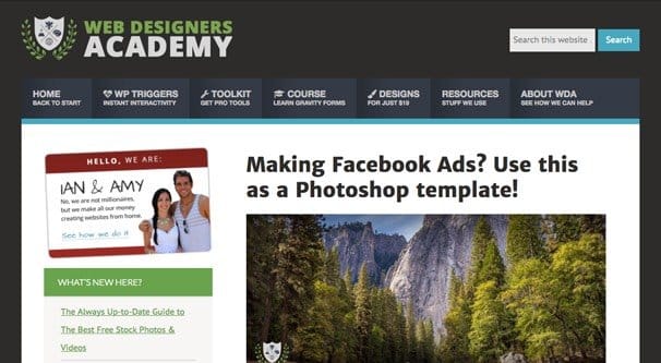
Web Designer’s Academy Ad Templates – This is a selection of four ads that have the most robust layout and design elements thus far out of any of the templates I’ve listed. Each ad is a different template, you can see the previews of which in the article linked. All four of them have a text and logo banner at the top, a primary color background, and additional elements.
One of them purely features a single graphical element. The next has a faded screenshot and a smaller graphical element. The next has several layered screenshots, and the final features a photograph. All of them can be tweaked and customized, by swapping out assets, changing text, changing colors, and making it your own.
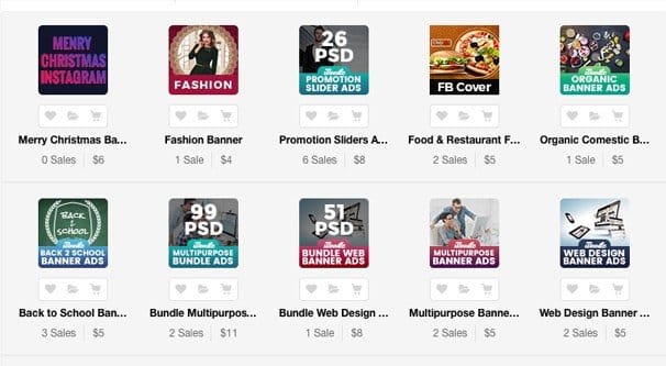
Paid Assets from Graphic River – This is a list of assets you can purchase the rights to use and customize, from Graphic River, one of the subsites that make up the Envato Marketplace. This is the specific category for Facebook ads in the search filters, but you might want to expand and look through other elements as well; sometimes templates can be miscategorized.
These assets are, unfortunately, not free. When you perform this search, you see all of the assets labeled “Facebook ads” which is unfortunately not consistent. Some of them are general banners or are designed to be advertorial versions of your cover photo. Some of them are also single image templates, while others are selections or bundles of different elements. You will be able to see a preview, as well as the number of sales and the sale cost of the element or bundle you’re looking at. Most of the elements have a handful of sales at most. Prices range from $2 to $17. The $17 pack actually contains 13 different sets of ad templates, ranging from sidebar ads to cover photos to news feed ads, for a grand total of 234 individual PSD files. That’s probably the best deal, actually.
Graphic River isn’t a high converting sub-store of Envato, as it turns out. Most of these template packs have under a dozen sales, so the designs are going to be more or less unique to your brand. That’s always one of the aspects of template usage you need to be aware of when you’re creating ads; templates that become too common become recognizable as templates, and people will feel worse about seeing them. You become more subject to banner blindness and get lower click rates. These templates won’t fall victim to that, because the chances of another competing brand using the same templates for the same audience is relatively nil.
Every Interaction’s Profile and Cover Photo Templates – Yes, I know that these aren’t actually ad images, but that’s fine. Some brands like to turn their cover photo into an advertisement, and others like to make the cover photo and profile picture merge into one more seamless entity for consistent branding. You can test images and position them in the proper order with this set of templates, available for free in a zip file.
56 Free Design Templates from Template.net – This set of templates are not specifically made for Facebook – in fact, many are specifically made for other forms of advertising, like brochures and for bus station print advertising. However, you can always take the templates and use the concepts or the basic designs as part of your advertising.
Template.net is actually one of the best repositories for templates on the net, since they’re always pushing out inspirational image packs, designs for various themes like a Thanksgiving theme for the holidays, and more. However, they don’t have a strong focus on social media. I recommend using them for print marketing or marketing via website or ecommerce site, and adapting any templates you do use into Facebook ads to maintain branding between them.
Dribble’s Facebook Page Resource Size Guide – This PSD file is a mockup of the current Facebook page design, the one that rolled out earlier in 2016. It’s an intricately linked selection of elements that shows how your page will look when you change the graphics for certain elements. It’s useful for mocking up the way your page will look after a change in graphical elements, including page post images – the same as ad images – and even tab app icons.
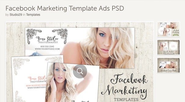
Creative Market’s Facebook Templates – This Facebook template set includes three PSD files, which cover a Facebook cover and a photo-size image for ads, which will work for many square-format ad units. It’s not free, as a license costs $10.
If you don’t like that one specifically, you can browse the Creative Market search results for other packs. Most of what they offer are cover photo templates, but there are some ad packs included. For example, this pack is $22, but includes 16 different designs, along with assets you can use in the form of images that don’t have licensing attached to them.
Full Circle
There are a lot of templates up there, but there’s not a lot of variation. Frankly, most templates for Facebook ads out there on the web are either far too old and thus rely on different ad sizes, or are focused on the grid tool to minimize the effects of the 20% text rule. The rest not covered in those categories are little more than size templates, with little thought put to design, if any at all. Why download a PSD when all you need is the pixel height and width? What exists in actual template form is surprisingly slim, and the designs are not all that varied.
Part of the reason for this, as mentioned all the way up at the top, is Canva. Canva is a free to use tool with hundreds of layouts for Facebook ads, many of which are extremely cheap. You can pick a layout and use it for $1 or something of the sort, and import your own assets to avoid having to use the assets that would otherwise charge you. Plus, the tool is simply too good at what it does, it’s driving other people out of business.
Whether you prefer Photoshop or Canva, there’s only so much a template can bring to the table. Templates always have the issue that, the more they’re used, the less effective they are. This is a bit delayed with the sheer size of the Facebook audience, but sooner or later templates will fail you. One alternative you can use at that point is to hire a freelance graphic designer. You can find such designers with Facebook ads experience on sites like Fiverr or Upwork, where they will happily use their own stock of custom templates and their graphical design knowledge to produce something original for your brand.
Branding is the most important part of this whole exercise. There’s no sense in using a template that doesn’t fit your branding. Colors are easy to change, but the tone and the design overall are harder. That’s why many brands make their own custom designs; so they’re not beholden to the limits of templates.
